


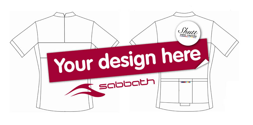

You came, you saw, you got out your crayons… in the end we had over 50 entries to the Sabbath / Shutt VR jersey compo, and we spent a long afternoon stroking our chins trying to make a shortlist. In the end the crudely-fashioned ‘votes’ (post-it notes, to you and me) were counted and the five finalists were chosen. And that’s where you come in! Which of the final five is your favourite?
All you have to do is vote below. Just click on the jersey design you like the best and hit ‘Submit’ at the bottom and we’ll do the rest, ‘the rest’ in this case being a bit of waiting followed by a bit of counting. You have until Tiffin o’clock on Friday (14 Jan) to pick your winner, and we’ll announce the results on Monday. Good luck to all our finalists!



18 thoughts on “Sabbath / Shutt VR jersey compo: voting is open!”
Ummm… I’m not seeing them
Ummm… I’m not seeing them (in Firefox).
Just a series of lines on the page that if I click on them it shows a green tick at the side.
:/
anyone else having issues? we
anyone else having issues? we can see the jerseys fine in firefox over here…
if you can’t see it you can try this link:
http://www.surveygizmo.com/s3/441679/Sabbath-Shutt-VR-jersey-competition
I can see them fine on
I can see them fine on Firefox and Safari on my mac 😀
maybe it’s an abu dhabi thing
maybe it’s an abu dhabi thing 😕
I like them all! That was a
I like them all! That was a tough choice.
It’s an outrage. One of
It’s an outrage. One of those is clearly a blatant rip-off of my original.
Ho hum. 😉
Pretty poor choice
Pretty poor choice really.
Why the preponderance of black, the dullest colour and one that lets you merge into the background when out on the road, and all but one (the white one) look like they were designed in the 60’s.
Boring…..
I won’t be buying any of them.
Why so dull? I’d go for
Why so dull? I’d go for brighter more visible colours and designs.
Have to agree with both
Have to agree with both Ironbloke and DaveBinks…. (|:
Dull, dull, dull!
( Not that I’m at all biased. )
Design #2 gets my vote!
Design #2 gets my vote!
The only one of that
The only one of that selection I’d feel safe wearing on the road is #1, but I wouldn’t be seen dead wearing it!
What’s wrong with a more subtle approach to higher visibility jerseys? Those of us who live in areas with high traffic densities (i.e. Warrington) need things like that…
I think you guys must have
I think you guys must have missed a part of the brief of this design.. its for sabbath bikes and there colours predominantly dark grey/black & red and to match there titanium bikes…
horses for courses on the colour choice..
Top one all day for me…
Top one all day for me… Lovely design. Number 3
@xcstu
I’m not a designer,
@xcstu
I’m not a designer, which is why I didn’t enter but I did see that the brief was for a Sabbath “colours” jersey. But there must be creative ways of keeping riders safer on the roads AND incorporating the brief…
@adamML
I totally hear what
@adamML
I totally hear what your saying.. It is an interesting topic because do motorist see cyclist full stop regardless of the colour of your top? I ride into London everyday and sometimes I feel I might as well be invisable (and thats with all the lights, bright clothing etc) 🙁
I do find it interesting that motor cyclist don’t really wear anything bright expect the odd hi vis on but they get the advert campaign to look out for them!
Is there a chance of a “Best
Is there a chance of a “Best Of The Rest” option?
I posted this comment last
I posted this comment last week but don’t see it on the record. Am I doing something wrong?
To reiterate:
If the selected design is one of the dark options, can Shutt produce both the selected option and its “negative” version where the dark colours are light and vis versa?
Posh
hmm… we’ll ask.
hmm… we’ll ask.