


It has been a fairly eventful winter for cycling in terms of sponsors changing and new bikes and kits coming on the scene.
This website has been right at the forefront of the action by allowing its readership to help choose the new Planet-X/Road.cc team kit for 2010. There is also a new Road.cc jersey in the pipeline too.
And despite a core of people who inhabit cycling message boards snobbily saying that it is degrading for someone to ride a replica team bike or wear replica team kit, I think a bit of fashion analysis is what this website needs on a Friday lunchtime.
So here goes. The styleometer has a maximum of 100% points. 50 for both the bike and the kit.
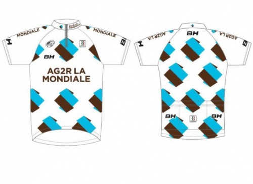
Ag2r-La Mondiale
Bikes has changed from BH to Kuota and they are nice looking. The kit changed mid way through last season to white, light blue and brown. It’s a ‘marmite’ moment, you either love it or hate it… I love it!
Styleometer percentage 85%.
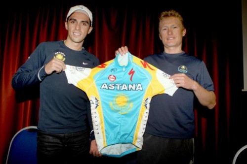
Astana
Trek departed with Mr Armstrong and his cronies so Spesh have come to the rescue. The bikes are ok, nothing special. The kit on the other hand has been widely compared to the sugar filled chewy ‘treat’ that is the Refresher.
Truly woeful.
Stylometer percentage 50% (all for the bike)
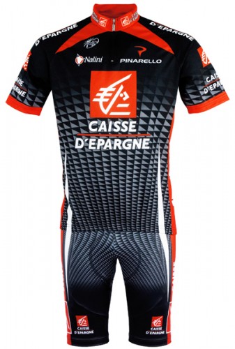
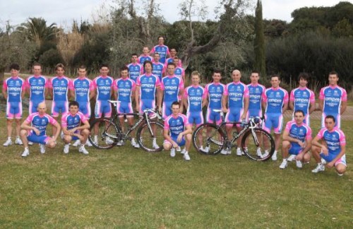
Caisse d’Epargne
Yawn! The bike is a work of art and gets top points. The jersey is ok but hasn’t changed in years and the pattern looks like they have tried to get a carbon fibre effect. It doesn’t work.
Stylometer percentage 65%

Euskaltel-Euskadi
As I ride and Euskatel painted Orbea in the winter I suppose I have to go big on the bike. It is nice looking but doesn’t make you go “wow”. The Kit was distinctive and fresh… in 2003. Bit boring now and could do with a refresh.
Stylometer percentage 68%

Française des Jeux
FDJ is an example of a barely changed kit working (unlike above). The jersey is wonderfully simple and the look goes beautifully with the patriotic red white and blue La Pierre bikes. Always one of the best turned out squads.
Stylometer percentage 85%
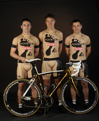
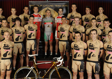
Footon-Servetto-Fuji
Oh my. The bike is a bit garish but that wont be the thing your eyes are drawn to. The kit has certainly been the most talked about of the season. What’s not to love about a flesh coloured kit with a bit black foot printed on it?
Well plenty as it happens. I am not a big fan and when you compare it against some of the true classic jersey’s over time (I am talking MG/Technogym and Casino) then it is nowhere.
Stylometer percentage 47%

Garmin-Transitions Slipstream
When the argyle thing first happened and Jonathan Vaughters was talking about “cycling as the new golf” I liked it. But you cant go half and half. The road.cc one works because it is all argyle, the Garmin one fails as it is neither patterned nor plain.
Not the worst, but not the best. The bike is a bit ‘meh’… nothing to get excited about.
Styleometer percentage 61%
Lampre-Farnese Vini
The distinctive rear end of the Wilier bike (you could only get away with saying that in cycling context!!!) makes this ensemble for me. The jersey has altered slightly but still suffers from being pink and purple.
Styleometer percentage 70%
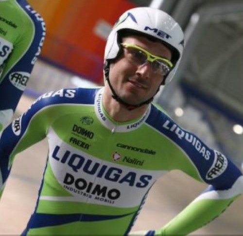
Liquigas-Doimo
I would walk 100 miles barefooted over broken glass to own a Cannondale bike, but not a lime green one. Jersey is abysmal. All points scored here are for the bike.
Styleometer percentage 48%
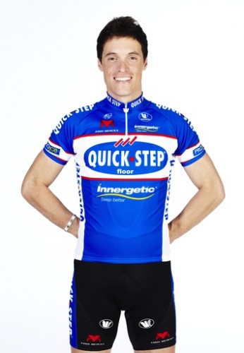
Quick Step
A real front runner this one! Eddy Merckx bikes make a re-appearance in the top end of the peloton. It looks a lovely effort but is still over shadowed by the wonderful new retro style jersey. Blue with a white band and a bit of red trim, it is virtually identical to the special cobbled classics kit they were denied from wearing last April.
Wonderful stuff.
Styleometer percentage 92%
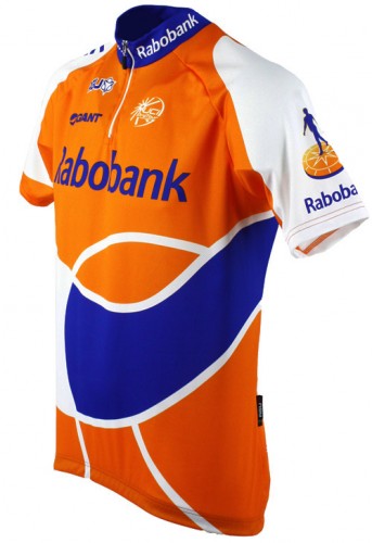
Rabobank
Giant bike is plain white but looks ok (apart from when Robert Gesink is falling off his). Jersey has evolved over the years rather than changed. I am neutral on this one, neither love nor hate it.
Stylometer percentage 75%
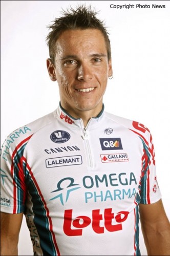
Omega Pharma-Lotto
This one looks a total mess. I have never been a fan of Lotto kits (apart from the red and black halved one that Andrei Tchmil rode to victory in that snowy 1994 Paris-Roubaix) and this is no different.
The bike on the other hand is a Canyon. Plain white like the Giant but for some reason it looks much nicer.
Styleometer percentage 55%
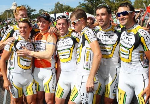
Team HTC-Columbia High Road
After the lovely blue effort of the 2nd half of 2008 the re-hashed Saunier Duval outfit for 2009 didn’t look great. Add in the lime parts from the Tour onwards and things don’t look great.
The bike on the other hand is lovely despite all the stickers on it. Could do much better would be my comment.
Styleometer percentage 72%

Team Katusha
This one is a grower on me and it definitely looks better this season with the blue sleeves. Ridley bikes are cool (fact!) and the whole package looks very stylish indeed.
Styleometer percentage 88%
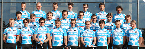
Team Milram
Where to start on this shocker? How about the bike, I can say something about the Focus. It looks ok and I love coloured break hood covers (having celeste ones over the Campag levers on my Bianchi).
The jersey is a cow print effect, I think that says it all.
Styleometer percentage 40%

Team RadioShack
The Shack has a bit of red and grey on their jersey and a multitude of different coloured Trek machines for its riders. I don’t like Trek bikes so points lost there. The jersey is ok, I don’t mind it compared to say the Astana one. So in terms of the war between Armstrong and Contador, the Texan is ahead on fashion.
Styleometer percentage 67%

Team Saxo Bank
Without the Cervelo bikes this team loses a bit of kudos for me. The jersey is run of the mill and the Specialized bike is only nice looking. But somehow put together it all works and the combined mark is more than the sum of the parts (if that makes sense).
Styleometer percentage 70%
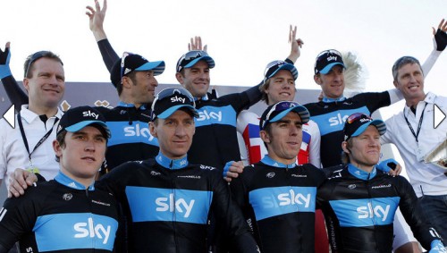
Team Sky
New kids on the block and one of the best turned out teams in procycling history. The jersey is plain and simple black with a blue band. I wasn’t taken at first but it is a grower and everytime I see it I think I looks better and better.
What more can you say about the Pinarello’s? A lovely bike and the only mark I can take off them for aesthetics is the use of Shimano over Campag.
A clear winner
Styleometer percentage 99%


21 thoughts on “Kits and misses – a 2010 fashion appraisal…”
The garmin transitions felt
The garmin transitions felt ar1 team bike is a bit ‘meh’?! You are really hard to please.
Jon Burrage wrote:The garmin
You are convincing me slowly but surely 🙂
48 seems quite a generous
48 seems quite a generous percentage for the Fuji jersey which is surely some sort of fashion crime
tony_farrelly wrote:48 seems
You should have a night out in Yaxley son, then you would see some proper crimes of fashion. 😀 😀 😀
Having watched the tt in the
Having watched the tt in the tour of qatar yesterday I agree that sky look the biz
The more I look at that
The more I look at that Fuji-Servetto outfit – well, the shorts – the more I think of the anatomy (or lack thereof) of Action Man, if you see what I mean 😉
I don’t go along with the 99%
I don’t go along with the 99% rating for the Sky jersey, never fond of dark colours on jerseys. I suppose I had better get used to them as I’m sure the Sky tv camera crews will be following them very closely!
The Caisse D’Epargne one
The Caisse D’Epargne one probably shouldn’t be viewed with a migraine or a hangover
I think the sky kit is
I think the sky kit is overated at 99% as well, its rather drab. They might not be Pro Tour but Rapha know how to do the all black kit.
Anyone else think that the
Anyone else think that the Garmin Transitions bike looks like the Sky kit?
Don’t know if that gives either team a pychological edge. If it does I suspect it’s for Garmin
It is a similar electric blue
It is a similar electric blue (I accept many graphic designers will drop their mac books in horror at that comment)
I am biassed but I do prefer the felt to the pina.
I actually meant the bike and
🙂 I actually meant the bike and the jersey, but now that you mention the two bikes…
What utter tosh. You sir,
What utter tosh. You sir, have no sense of style. Sky’s technical, but bland affair getting 99%, while Astana and Liquigas get all their points for their bikes? For Specialized and Cannondale? Total idiocy. At least Liquigas have the decency to have a green kit, not enough green in the peloton. Mmmmmm.
Lampre’s now run-of-the-mill combo outdoing Garmin. NO, lunacy. And however much I don’t like Pinarello, Valverde Piti and his whole team, the one thing Caisse d’Epargne have is a very stlish set-up.
I will give you some credit though, as the Quick-step and FDJ are head-and-shoulders above the rest.
So overall, I’ll give you 48% for this article, mostly because I like the concept.
SinglespeedJarv wrote:
So
you generosity only gets 27% from me 😀
Hey, what about Cervelo Team
Hey, what about Cervelo Team Kit!
Quote:Astana and Liquigas get
you *like* astana’s kit then? 😕
with you on Garmin. but not on Cannondale. that is one niiiiice looking bike. specialized? meh.
also, quick-step’s kit is a
also, quick-step’s kit is a total dog’s breakfast. it doesn’t look ‘retro’, but it does look ‘crap’
Cactuscat, I disagree, it is
Cactuscat, I disagree, it is not possible for a Cannondale to be a nice-looking bike. It has the word Cannondale on it. Didn’t say I liked Astana’s kit, although it is a considerable improvement on last year.
Saddleback – Cervelo are not included as they are not in the Protour. However, their kit is far superior to any other that I can think of off the top of my head.
I too noticed the similarity
I too noticed the similarity between Sky’s Pinarello and the blue&black of Garmin’s Felt. At least we can’t confuse their jerseys!
I’d prefer to see more blue and less black. Saxo now have dark shoulders too, which doesn’t help if you’re looking from ahead. In a fast-moving peloton they seem to be hard to distinguish. Perhaps we’ll now see some ZipVit flashes to break it up a bit.
I wonder if Sky will ‘do a Cervélo’ when the summer sun beats down and run a white jersey with the blue band across the chest?
Simon E wrote:I too noticed
hmm… well, they’re going to have a big on-line shop to stock, that actually might look better too
Katusha! “a grower” well so
Katusha! “a grower” well so is mould, but I wouldn’t give that 88% for style :O