


We did this in the blog last year but everyone else has jumped on and done it already in 2011… I suppose I should be sharper and stop working/preparing to be a Dad for 5 minutes 😉
But hey! why change a winning formula.. so what does everyone think of the 2011 kits then?
Click here to see the graphics created by cyclingfans.com
It pains me to say it but the best of the lot for me has to been Radioshack…
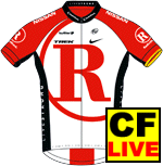
…I know, I know. It stands for a lot more than a cycling jersey and you are either pro or anti Lance. But as well as feeding my addiction for ‘tweeting’ by having a Twitter logo on (http://www.twitter.com/jimmythecuckoo) it is actually a really smart kit.
So it could be on the shopping list with that patriotic nod to Team Sky being put on hold !
What does everyone else think?


7 thoughts on “Best 2011 World (Pro) Tour jersey..?”
Rabobank for me. Looks better
Rabobank for me. Looks better in the flesh than it does on that CF page, really classy. they should do a wool one.
Team Leopard for me
Team Leopard for me
+1 for Leopard Trek, probably
+1 for Leopard Trek, probably has an advantage by not having a big old sponsor’s logo plastered all over it.
Quite like the Movistar too (and at least with the green helmets they’ll be easy to pick out).
There are a fair few shockers in there this year, mind.
Yeah. The Radio Shack kit
Yeah. The Radio Shack kit does look good. Stood out well on TV during TDU as well. Ultimately though I’d say Team Sky have the strongest. Remember the days when Formula One teams typically had one sponsor? The cars looked so much better. What was more beautiful or cohesive than a JPS-Lotus, an Elf-Tyrrell or indeed a Durex-Surtees? The same goes for cycling kit – too many big logos dilute the look.
Sorry, but the Radioshack
Sorry, but the Radioshack shirt looks like Team Rocket from Pokemon
http://img2.moonbuggy.org/imgstore/team-rocket.jpg
That must be why I like it.
🙂 That must be why I like it.
I like the Euskaltel-Euskadi
I like the Euskaltel-Euskadi kit, as it is so bold.
And HTC has gone backwards. Its so much worse than last year with the silly vertical stripe. X(