- News
- Reviews
- Bikes
- Accessories
- Accessories - misc
- Computer mounts
- Bags
- Bar ends
- Bike bags & cases
- Bottle cages
- Bottles
- Cameras
- Car racks
- Child seats
- Computers
- Glasses
- GPS units
- Helmets
- Lights - front
- Lights - rear
- Lights - sets
- Locks
- Mirrors
- Mudguards
- Racks
- Pumps & CO2 inflators
- Puncture kits
- Reflectives
- Smart watches
- Stands and racks
- Trailers
- Clothing
- Components
- Bar tape & grips
- Bottom brackets
- Brake & gear cables
- Brake & STI levers
- Brake pads & spares
- Brakes
- Cassettes & freewheels
- Chains
- Chainsets & chainrings
- Derailleurs - front
- Derailleurs - rear
- Forks
- Gear levers & shifters
- Groupsets
- Handlebars & extensions
- Headsets
- Hubs
- Inner tubes
- Pedals
- Quick releases & skewers
- Saddles
- Seatposts
- Stems
- Wheels
- Tyres
- Health, fitness and nutrition
- Tools and workshop
- Miscellaneous
- Tubeless valves
- Buyers Guides
- Features
- Forum
- Recommends
- Podcast
OPINION
The evolution of a jersey...
 WeightBlog
The final Saturday in January of 2015 will see the 5th anniversary of Steve Milne and myself founding Yaxley Riders Cycling Group.
There will be plenty written and said in celebration of this moment in coming weeks as we look to compile a full history of those years.
One area that has been interesting to follow has been the evolution of the groups jersey over those years.
The original kit ran for two years and sold in such places as the Netherlands and Channel Islands.

The white blue and black colour scheme was designed to keep us consistent with other village sporting teams and there are a few still around being used. The second year of this design did see the wording changed slightly to reflect the launch of the website.
Our second design was a turbo training one without pockets, but including names on the back. It was black and blue and also promoted the website address.

Our first online store featured kit designed by Steve Milne and Gary Gwynn and was the first in black and orange.
This one sold well and is still seen on a number of riders.

This one was the first to feature bib shorts and winter clothing such as jackets, and gloves.
The challenge for us was the lengthy delivery time so we looked hard to source a supplier in the UK. Godfrey Sports in Nottingham provided the best samples and being UK made fitted the bill.

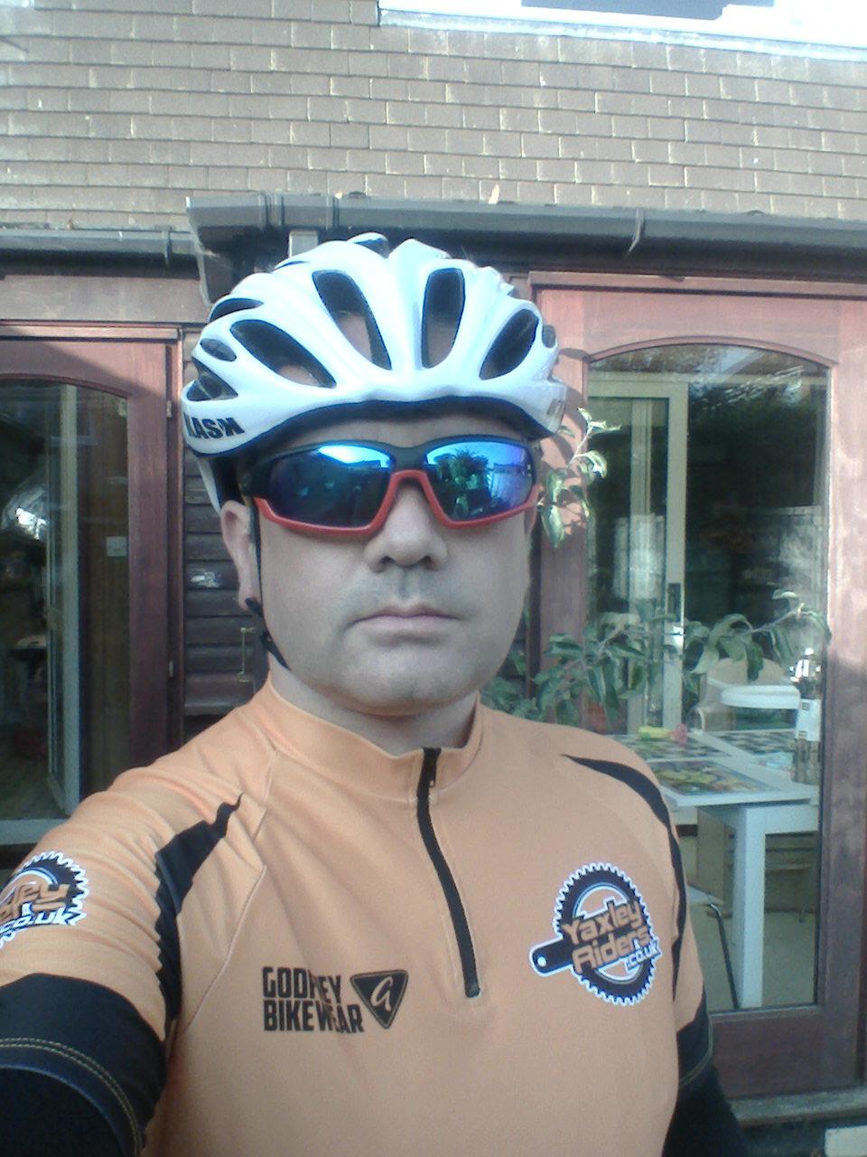
After much discussion on the design and colours, we decided to keep the same layout on the jersey but make orange the predominant colour for visibility and safety.
Its been the best seller to date and we will be keeping this design for the foreseeable future.
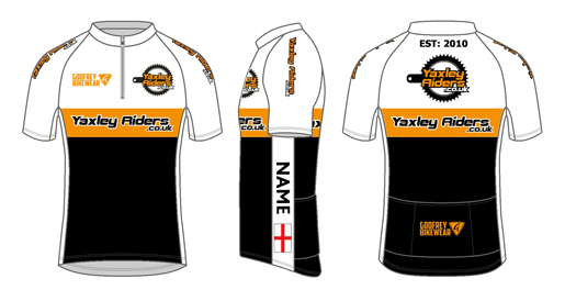
That hasn't stopped us indulging our passion for great looking cycling gear by commissioning Godfrey to come up with a jersey to celebrate the 5 years by taking elements of all the kits we have had so far.

We launch it soon with a one off ordering window to get your hands on one 
More Opinion
Latest Comments
- pbunyon 3 sec ago
Looks built out of a washing machine
- Disgusted of Tunbridge Wells 42 min 22 sec ago
When you get a ticket???
- chrisonabike 52 min 27 sec ago
In one sense (the most important one) evidence is irrelevant....
- chrisonabike 2 hours 46 min ago
That was the one (same name in Scotland). Haven't tried a Boris bike yet (or Ken/Khan-cycle ?) but my understanding is they're conceptually...
- wtjs 2 hours 53 min ago
It does say '12S' on the chainring! All we need now from this 'club member' is the picture of the actual crank break
- Bungle_52 4 hours 20 min ago
I think you may have misunderstood the word carnage....
- galibiervelo 5 hours 25 min ago
Love the design. The limitation to 170 mm cranks sent me to the kickR
- S.E. 6 hours 4 min ago
I'm not doing single track (no suspensions, only 30, 35 mm tyres) so 800 lumen is enough for me, on gravel type of trails at maybe max 20-30 km/h,...
- ktache 9 hours 26 min ago
There is a pHd student at work who has an Adidas backpack in reflective iridescence, looks oil slicky in the day. I love both oil slick and...
Add new comment
2 comments
Well the newest design is definately the best.
It also seems a good functional approach too - dark colours where grubby hands go (or muddy water splashes up); Contrast in middle section to help people see you; and lighter section at the top to help overheating in sunny weather. Nice
I like the idea of combining l the previous jerseys. Producing something that pays homage to them and picks the best bits. its definetly not a boring. Contrasting loud colours are the way to go.
www.tinpony.co.uk