

Bristol’s notoriously “invisible” cycle lanes could soon be set for a long-awaited makeover, after the local council revealed that high-friction red paint could soon be installed on some of the city’s cycling infrastructure, as part of a trial aiming to reduce conflict between cyclists and pedestrians.
However, while cycling campaigners in Bristol praised the initiative, saying it will help differentiate the city’s cycleways for both cyclists and pedestrians, while making them more visible for motorists, they also argued that a new colour scheme will do little to make “disjointed or poorly designed” cycle lanes safer to use.
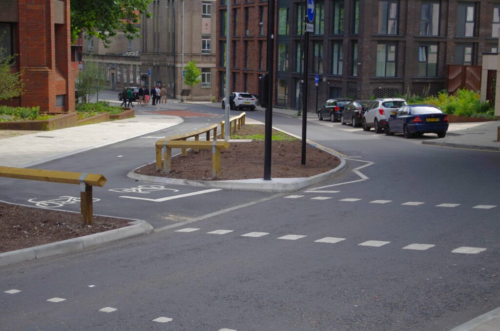
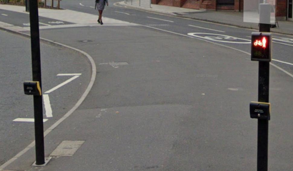
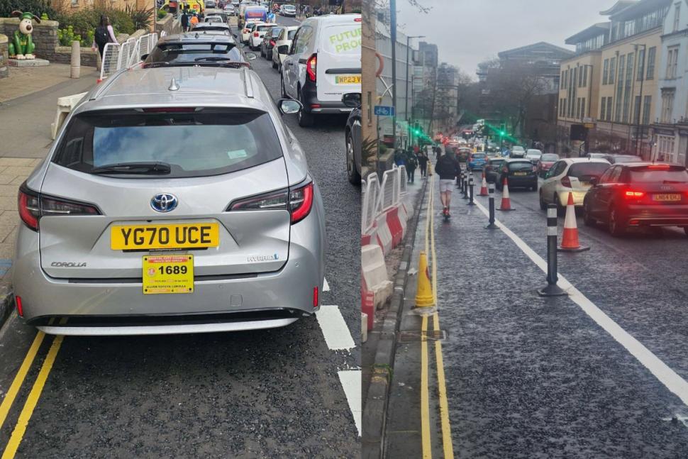
The inability to easily distinguish many of Bristol’s bike lanes from adjacent pavements or other parts of the road network has been a long-running problem in the city, especially in areas where there is no physical separation between pedestrian and cycling zones.
Last week, a senior councillor confirmed that the two-way bike path next to St Augustine’s Parade will be made “more visible”, via a splash of colour, as part of ongoing works in the city centre.
And now, Bristol City Council is set to approve a trial which will see at least one cycle lane painted red, in a bid to “reinforce the road hierarchy and improve safety at key conflict points”.
The trial, which is expected to cost up to £250,000, funded by income generated by the Clean Air Zone, will be implemented either on recently installed cycleways or ones that are due to be completed soon.
Two new protected bike lanes on Bristol Bridge and the ‘Old Market Gap’ between Castle Park and Old Market Street are under consideration for the scheme, as well as the soon-to-be-installed infrastructure on Union Street, Bedminster Bridges roundabout, and Redcliffe roundabout.
Four different colours, used for cycling infrastructure across the UK, were considered for the trial, including green (deemed difficult for people with visual impairments to distinguish from grass), blue (which councillors say could be confused with the similarly coloured shared path sign), and yellow (dismissed as too “loud and garish”).
In the end, red was chosen due to its ability to “stand out effectively”, while also matching other bike paths in Bristol. Nevertheless, some councillors argued that red “could be quite aggressive” and may cause confusion with bus lanes.
During the trial, the council says staff will monitor near misses between cyclists, pedestrians, and motorists, along with the number of cyclists and pedestrians who inadvertently stray onto each other’s prescribed zones. A survey could also be conducted to assess locals’ perceptions of safety and legibility.
If the test proves successful, the red paint could be rolled out to bike lanes across the city. The plans are expected to be approved by the council’s transport policy committee on Thursday 15 May.
“There are several benefits to a roll-out of colour on cycle lanes,” a committee report on the scheme said. “It has the potential to reinforce the road user hierarchy and improve safety at key conflict points, and would enhance public perception of meaningful progress towards a high quality, densely connected segregated cycle network.
“Unintentional pedestrian use of the cycleway, which can carry fast-moving yet often very quiet bikes, is a key danger of new infrastructure, and can negatively affect the public perception of cycling in Bristol. This is especially important when considering older people, families with young children, or those with more restricted mobility or impairments of sight or hearing.”
Meanwhile, Ed Plowden, the chair of the council’s transport and connectivity committee, told B24/7: “I am keen to test this new approach to our cycleways, as it should tell us if using a red surface helps to reduce the number of pedestrians and other road users moving into cycle paths by mistake, before deciding whether to roll this approach out across the city.
“It would be a significant investment if we decide to update our policy, so careful thought needs to be given to make sure it is effective before we commit to this in the long-term.”
In written statements submitted to the committee, the Bristol Cycling Campaign praised the initiative, but warned that it must be implemented as part of wider improvements to the city’s cycling infrastructure.
“We are very pleased that BCC are considering how to make cycleways easier for cyclists to follow, more visible to motorists to avoid and to help alert pedestrians by distinguishing them using a consistent colour scheme,” a campaign spokesperson said.
“However, it is important to note that adopting a unified cosmetic colour policy will not make disjointed or poorly designed cycle lanes safer to use or encourage more people to cycle. ‘Lipstick on a pig’ comes to mind.
“Coloured surfacing helps drivers see where the cycle lane is and makes it easier for cyclists to follow them at intersections, and especially at potential conflict zones.
“Evidence shows that it can help to reduce the level of vehicle encroachment and speeding, increase the propensity of drivers to yield the right of way to cyclists, and deter illegal parking or loading in cycle lanes.”
A spokesperson for the Bristol Walking Alliance also told the council: “There is the desire to improve the experience for pedestrians and cyclists in the Centre where cycle lanes are indistinct and lead to conflict.
“Many pedestrians, particularly those who have mobility, cognitive, visual or hearing impairments, can be afraid to use spaces which cyclists may enter and cross unexpectedly.
“Unless cycle lanes are easily distinguishable, pedestrians and cyclists may not be aware of the designated lanes. This may cause pedestrians to stray into cycle lanes and cyclists to stray into pedestrian areas.
“It has been apparent for some time that the cycle lanes across the Centre in Bristol are a problem. The cycle lanes are not easily distinguishable from the pedestrianised areas, leading to conflict between pedestrians and cyclists.”
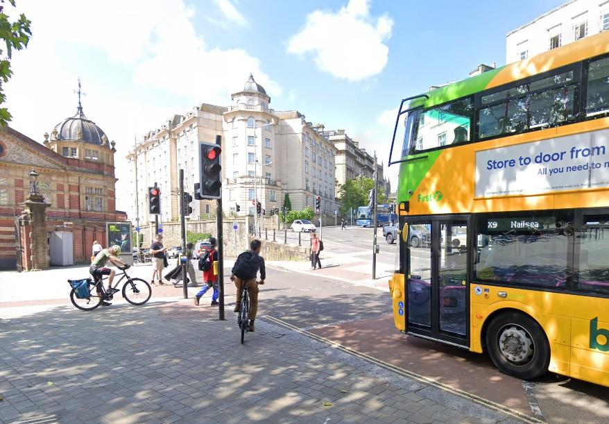
The potential for conflict between pedestrians and cyclists has long proved the bane of Bristol councillors attempting to improve the city’s cycling infrastructure.
In February, for instance, one opposition councillor claimed that proposed changes to a busy city centre junction, which involved installing planters on the pavement to restrict crossing points near a cycle path, will “worsen” the conflict between cyclists and pedestrians at a spot where people on bikes already “get annoyed”.
However, the local authority said that, by funnelling people into a narrower space at the crossing near St Augustine’s Parade, it will prevent them from crossing at a “more dangerous and hazardous position”.
And of course, this potential red paint trial isn’t the only cycling-related improvement introduced in Bristol in recent months.
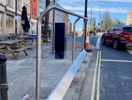
Last month, we reported that new support rails for cyclists, a first for the city, were installed near the top of both Colston Street and Upper Maudlin Street, enabling people on bikes to rest their hands and feet without getting out of the pedals while waiting at traffic lights on those two steep city centre hills.
However, despite their obvious benefits for people on bikes, the new railings were quickly criticised by motorists, who branded them a “complete waste of taxes”.
A few weeks before, we also reported that Bristol City Council was forced to act quickly to place bollards on the Upper Maudlin Street cycle lane, after the newly installed cycling infrastructure was immediately blocked by drivers’ parked vehicles.
Local cyclists had complained that the new painted cycle lane was soon completely unusable due to the number of parked vehicles in it outside Bristol Royal Infirmary, prompting the local authority’s swift response.


11 thoughts on “Bristol’s “invisible” bike lanes to be painted red to reduce conflict with pedestrians – but cyclists warn “lipstick on a pig” approach will not make “disjointed” infrastructure safer”
I have ridden on the path at
I have ridden on the path at St Augustine’s plenty of times and I am not sure I have ever managed to get from a to b without seeing someone wondering aimlessly along it, the cycle lane markings were useless. Hopefully the changes will help.
Even though it’s a very late
Even though it’s a very late “sudden realisation” I am pleased the place is taking steps to make different spaces for different modes a bit clearer.
The principle of things being self-explanatory is extremely important. Especially as we’re at best indifferent on “road use training” (even drivers only get formal lessons in using their mode of transport once in their lives…). It’s also surprisingly hard to do well – probably because we’re mostly pretty poor at extrapolating how others will understand something once we have “explained it to ourselves”.
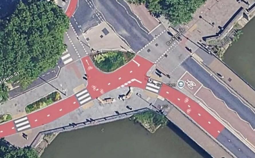
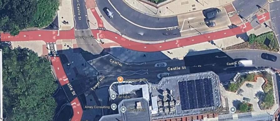
…BUT … as usual we’re in “3rd class cycling infra” territory here – look at the gold standard:
a) coloured asphalt for cycle infra rather than just surface paint (and of course markings on the cycle path last longer without lots of motor vehicles running over them…) (how did it come to be red?)
b) one colour for “cycle path” across the country (mostly)
c) other clear markers such as kerbs with level changes around the cycle path
d) enough space for pedestrians so they don’t *need* to be in the cycle path!
I’m thinking that general use
I’m thinking that general use roads (ie those which motor vehicle drivers are allowed to use) should be red, rather than cycle lanes.
Cycle lanes should be green to indicate they are… greener.
Imagine the change in mindset if people saw those colours everyday.
OK, I know not everyone will change their minds.
But it could be a good use of nudge theory.
I know that some might argue painting roads for drivers red might make some drivers say “get off the road”, thinking that cyclists aren’t allowed to use them, but we already get that now.
So they need to be educated that the only roads that cyclists can’t use are motorways.
And pavements can be kept the standard grey.
Maybe shared use paths could be blue, or some other easily distinguishable colour from the other 3.
Surely if the idea is to show
Surely if the idea is to show that motor vehicles are dirtier, the appropriate colour to paint things would be black or grey… oh…
Weren’t cycle lanes
Weren’t cycle lanes originally green tarmac or am I imagining that.
Fwiw it don’t make any difference, colour blind people won’t be able to tell anyway, but some of our local cycle paths are red coloured and it in no way stops pedestrians randomly walking into them and treating them as paths.
I think that’s chronic lack
I think that’s chronic lack of investment.
The most imortant thing IMO is a standard, as soon as possible.
There’s been a little
There’s been a little discussion of this issue over here in the forum: https://road.cc/content/forum/bristol-invisible-cycle-lane-finally-be-made-more-visible-313785#block-node-comment-block-node-comments
The photos with this article don’t show the worst bits of invisible lane in the center:
Where I live in South London
Where I live in South London we have a city centre cycle lane that is a different colour to the pavement. If anything the pedestrians seem to be attracted to it and you often see more on the cycle lane than the pavement next to it.
Here’s an opinion piece about
Here’s an opinion piece about cycling in the centre: https://www.bristol247.com/opinion/your-say/walking-cycling-through-centre-currently-confusing-mess/
Work starting June 9th: https
Work starting June 9th: https://www.bristol247.com/news-and-features/news/cycle-path-through-centre-not-invisible-much-longer/
hawkinspeter wrote:
Sounds good!
I note that in some cities they’ve used the metaphor of a “red carpet” (with literal red infra) for cyclists e.g. on particular cycling “routes” they’ve signalled this mode is prioritised. e.g. here (in this case it’s a “cycle street” which also fills in a “missing link”).
Being able to see the “way forward” very clearly is helpful when you’re cycling somewhere visually busy and new.
I’m not bothered which colour but ideally we should settle on one nationally and then all cycle infra should be marked with it (in the absence of clear reasons not to e.g. perhaps specific heritage sites?) The red seems to have been an arbitrary choice but it does also match e.g. brick surfaces (which are also useful to indicate this isn’t a place for drivers to go fast).