


The 2015 race season is nearly upon us, and if you want to make any sense at all of what’s going on in the peloton you need to know who’s who. Here’s our guide to what each team will be wearing out on the road.
There are 17 WorldTeams, down from 18 in the top tier last year. Cannondale and Garmin-Sharp have merged and Europcar has gone down to Pro Continental status while IAM Cycling has moved in the opposite direction.
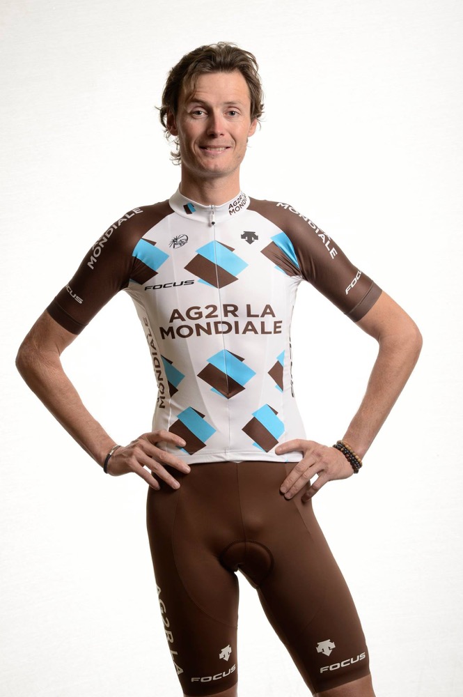
Ag2r-La Mondiale

France’s Ag2r-La Mondiale are sticking with predominantly brown kit again this year. Curiously enough, no other team in the peloton seems to be challenging them for the ownership of that colour.
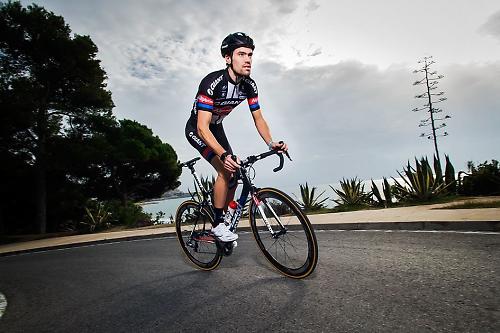
New recruit Johan Vansummeren even goes with complementary accessories. Good attention to detail from the tall fella. If he carries that level of clear thinking into his racing, he’ll pick up a hatful of victories this year.
Astana Pro Team
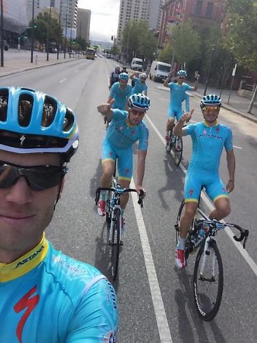
Astana stick with a predominantly light blue kit but they’ve tidied things up this year, doubtless stung into action by our Dave’s furious invective from last year. He denounced the 2014 Astana strip as “a mess”. Scathing stuff. He doesn’t mince his words, that lad.
Anyway, they’ve put all that behind them, ditched about a dozen logos, and come into 2015 looking altogether more classy. That yellow collar is a strong new addition. Nice turnaround from the boys from Kazakhstan. Not that their kit is the biggest problem that needed fixing, but you’ve got to start somewhere.
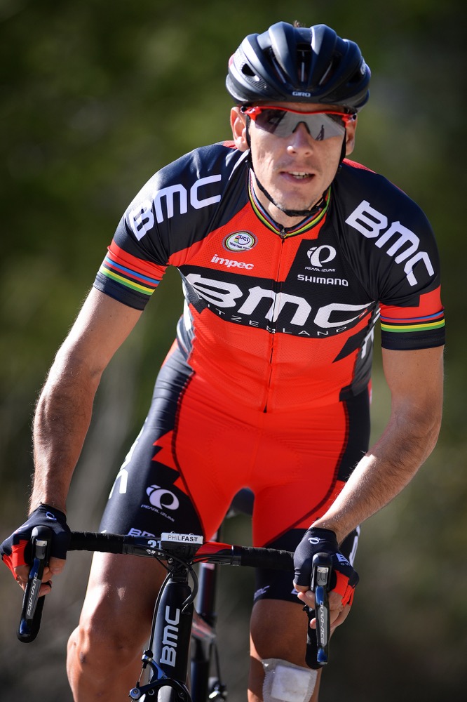
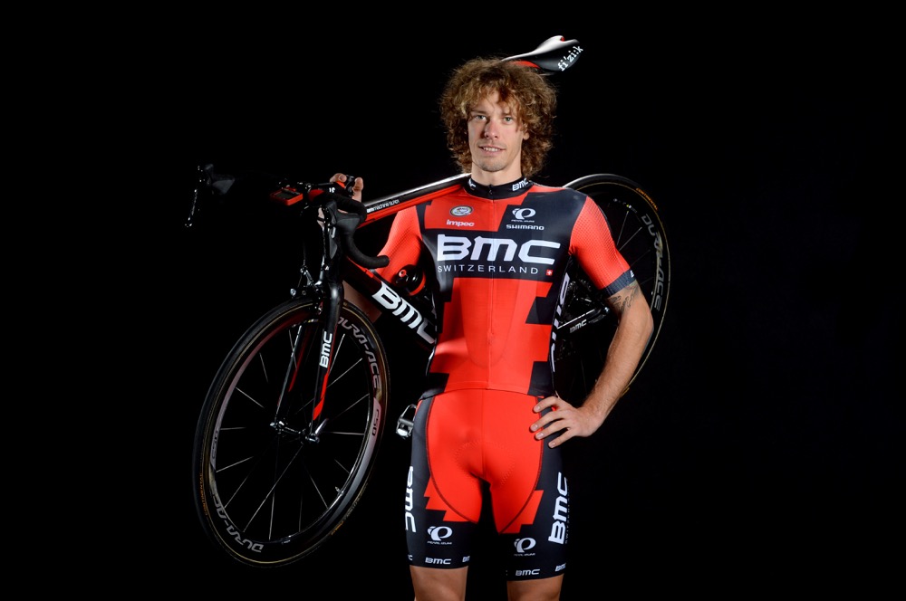
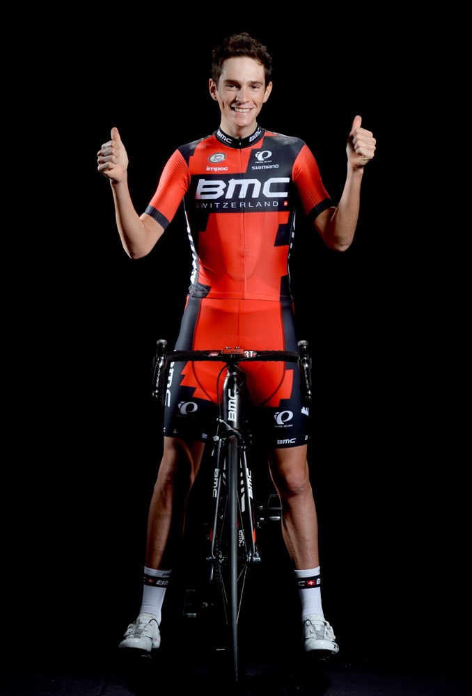
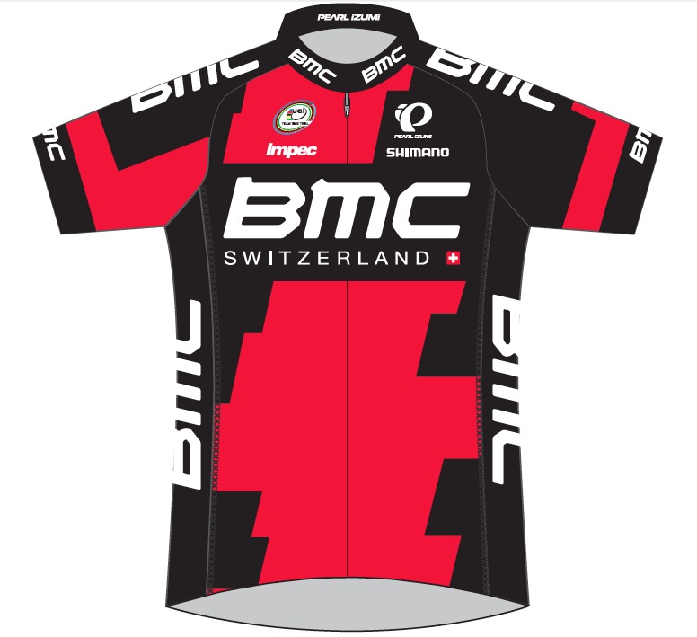
BMC Racing Team
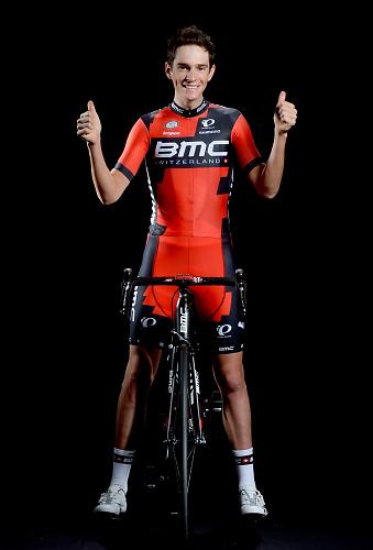
© Tim De Waele
The BMC kit looks very similar to last year’s, which in turn was exactly the same as the year before’s; they’ve just rearranged the blocks of red and black a bit and swapped a few logos.
New boy Manuel Senni gives it a Fonzie double thumbs up like off of the 1970s. Not that he’d know that – he wasn’t born until 1992. Heeeeey!
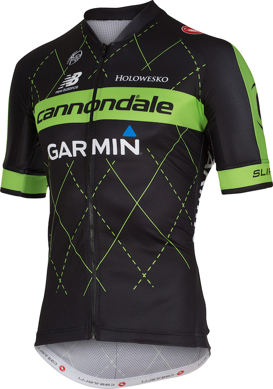
Cannondale-Garmin Pro Cycling

The former Cannondale and Garmin-Sharp teams have now merged into Cannondale-Garmin. The new kit from Castelli combines Cannondale’s green and Garmin-Sharp’s argyle design (which was previously blue), so you get green – and black – argyle.
That sounds a hideous concept. It would be easy to say the reality is hideous too but, credit where credit’s due, we reckon they’ve done a good job here to get it up to more or less okay.
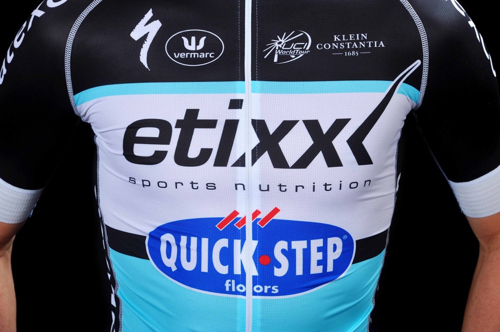
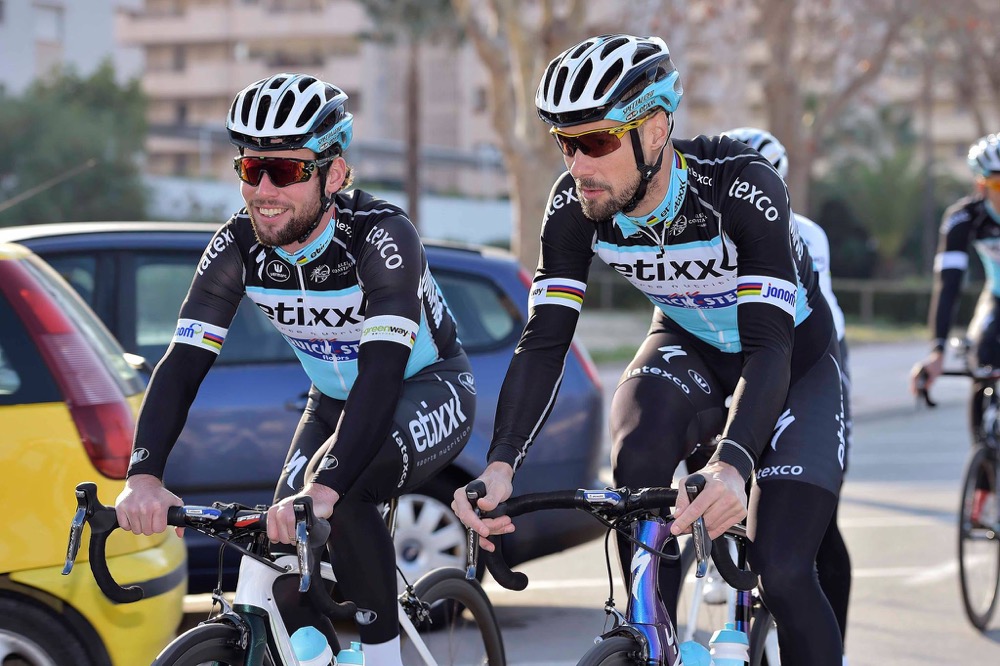
Etixx-Quick Step

Omega Pharma-Quick Step is no more. But behold! See, from the ashes rises Etixx-Quick Step.
Or, put another way, the Belgian team has changed a title sponsor. Actually, it’s not even that, really. Etixx is Omega-Pharma’s own sports nutrition brand.
Along with a change of logo, the new jersey is more light blue than before. Only those who have won world champs, like Cav and Boonen, get the rainbow stripes.
FDJ.fr
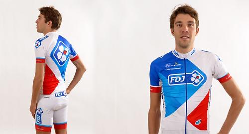
The cycling world was rocked to its core a couple of years ago when FDJ.fr switched from white to blue. You’ll never guess what they’ve done now. They’ve only gone and blinkin’ swapped back again. When will this madness ever end?
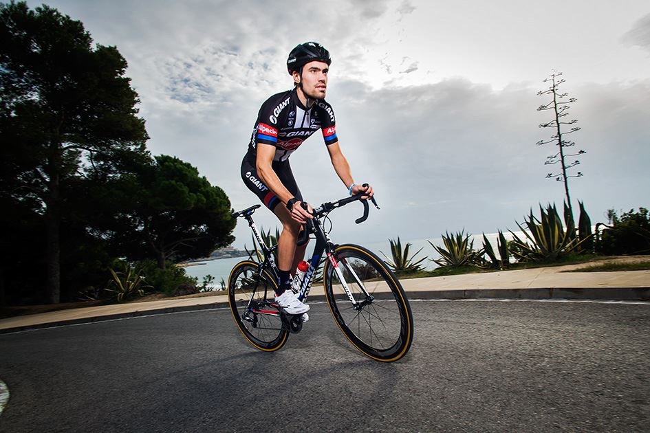
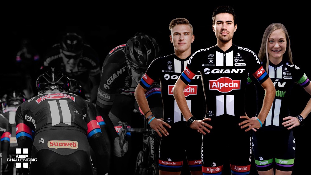
Giant-Alpecin
Team Giant-Shimano aren’t Team Giant-Shimano anymore, they’re Team Giant-Alpecin. You know who Alpecin are, don’t you? They’re the shampoo people. German engineering for your hair. We’re expecting huge things on the coiffuring front from this lot.
Giant-Shimano’s kit was black, white and blue, and so is the new Giant-Alpecin kit from Etxeondo; it’s just a little less liquorice allsorty. They have many logos. Arguably, too many.
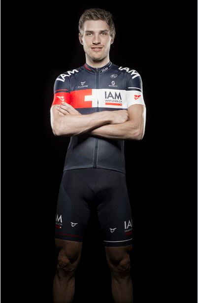
IAM Cycling

Switzerland’s IAM Cycling are a new addition to the WorldTour having stepped up from Pro Continental status for 2015 after racing both the Tour de France and the Vuelta a Espana last year. The jerseys are very dark blue with a chest band that incorporates features of the Swiss flag. Yeah, pretty cool in an understated kind of a way.
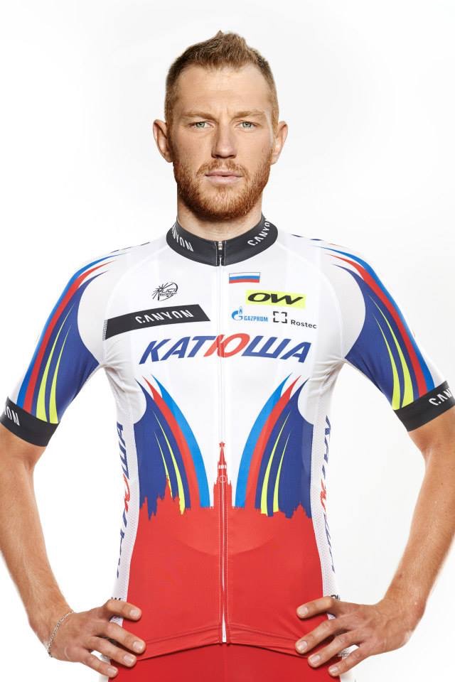
Katusha
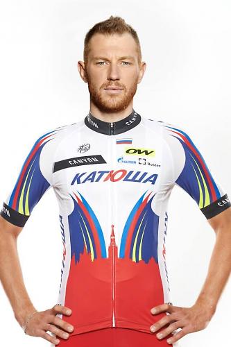
Katusha have gone nuts with their design. There are stripes all over the place, logos here, there and everywhere, a bit of yellow highlighting chucked into the mix, and even a silhouette of the Kremlin. It’s a bit of a dog’s breakfast, to be perfectly honest with you, which probably means that in 20 years’ time hipsters (or whatever they’re called then) will be fighting over this one.
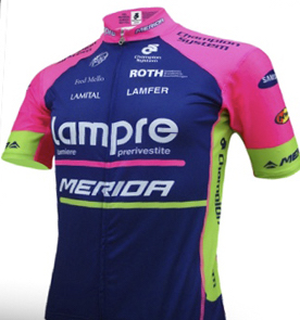
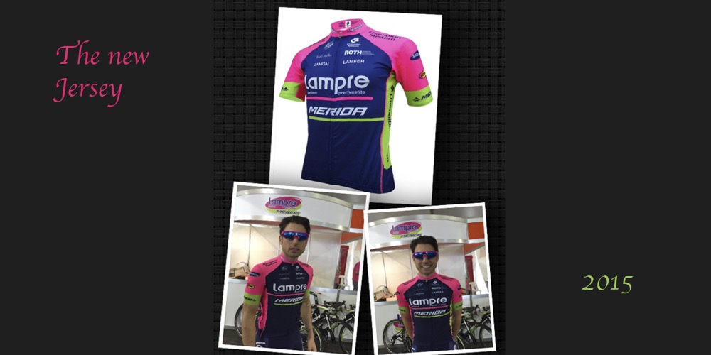
Lampre-Merida
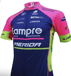
Italy’s Lampre-Merida have a tricky job integrating Merida’s corporate green with Lampre’s blue and pink. That combination is – how shall we put this? – challenging. The kit is very similar to last year’s with a few logo changes. It’s more attractive than the year before’s design although, admittedly, that’s not saying much.
Lotto NL – Jumbo
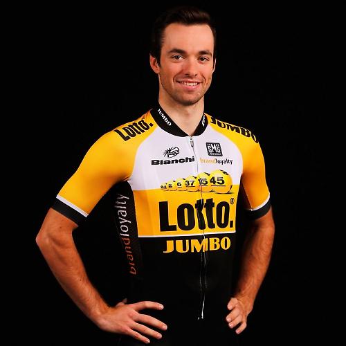
Dutch Team Lotto NL – Jumbo used to be Belkin and before that Rabobank. Along with the new sponsors comes a totally new kit.
If you were in any doubt about what Lotto NL is, the kit designers have hammered it home with a picture of lottery balls across the chest of the jersey. They haven’t been so free with pictures of elephants so you can guess who’s stumping up the majority of the sponsorship money (boom-tish!).
Coincidentally, the numbers 24, 2, 6, 37, 15 and 45 are the winning balls in next Saturday’s National Lottery here in the UK. This will be confirmed in National Lottery: Win Your Wish List with Shane Richie, starting at 8:30 on BBC1.
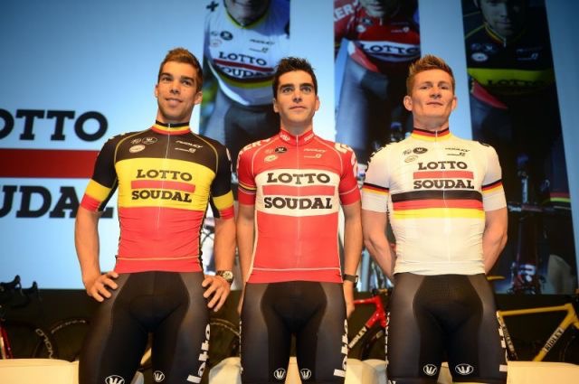
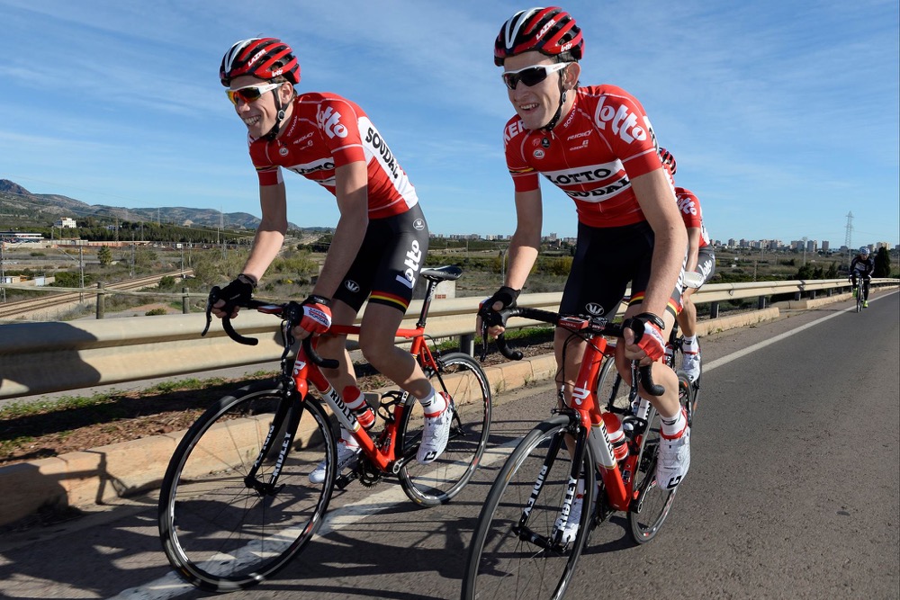
Lotto Soudal
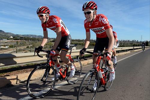
Lotto-Belisol has changed its name for 2015, Soudal stepping up to become a title sponsor. Who are Soudal? Only Europe’s leading independent manufacturer of sealants, PU-foams and adhesives for experts and for private persons, that’s who.
It’s one of the more classic and classy jerseys in the peloton, we reckon. Powerful. It’s worth at least an extra 2mph in a sprint finish.
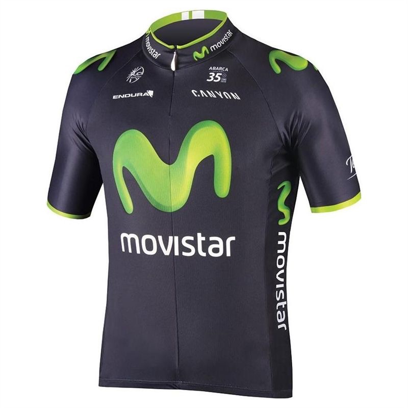
Movistar Team

Movistar’s kit from Scotland’s Endura appears to be exactly the same as last year’s (we’re talking about the looks rather than the technical attributes of the clothing which we know to have been developed). In 2014, we accused the design of looking ‘a little dated’. Now, just one year on, we’re giving it a seal of approval as ‘retro’. That’s the fickle world of fashion for you.
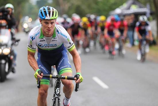
Orica-GreenEDGE

Looks exactly the same as last year. If they can’t be bothered to make the effort then neither can I. Next.
Team Sky
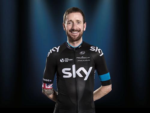
Rapha might have updated the technology in Sky’s jersey, but the only visual difference we can spot from last year’s is the addition of a blue line around the top of the collar. Oh, and there are some new stripes around the back. The devil’s in the detail, clearly.
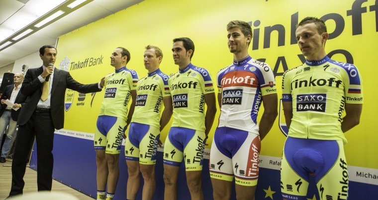
Team Tinkoff-Saxo

Tinkoff-Saxo went big with yellow last year. This time around they’ve gone even yellower, included a Russian national flag and added the Tinkoff Bank script in Cyrillic (Peter Sagan is in his Slovak national champion version).
That’s a heady mix. Distinctive, until we get to the Tour de France (or any other race where the leader wears a yellow jersey) when it becomes confusing. Maybe they’ll switch to their camo training kit for those races.
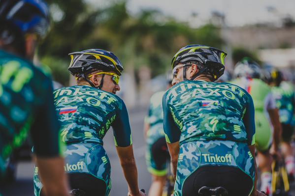
Or maybe not!
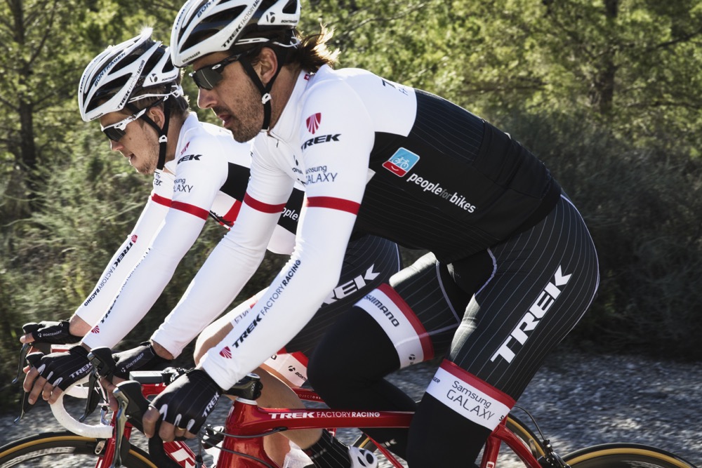
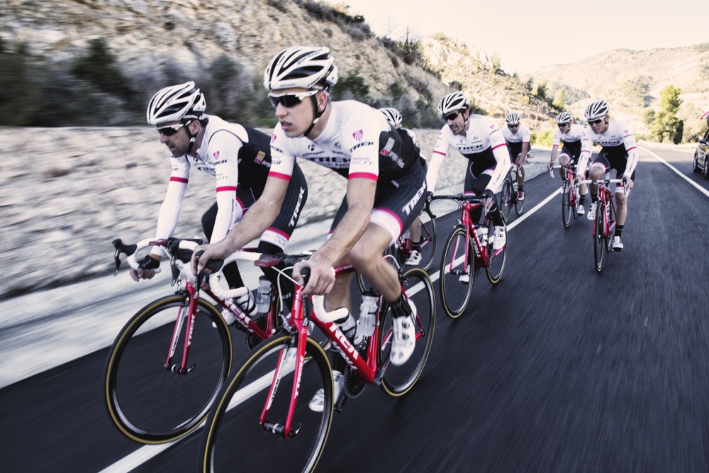
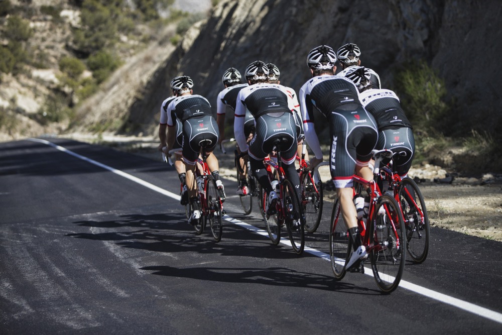
Trek Factory Racing
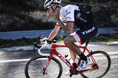
Trek’s kit was black with white pinstripes last year. This year they’ve kept both of those elements but added a large area of white across the top of the chest, shoulders and upper back, and also included red accents for more visibility in the peloton. They’ve moved from black and white bikes to viper red too, so you should be able to see them coming.
Right, over to you. What do you reckon? Give us your top 3 in the comments below.


34 thoughts on “Your cut out and keep guide to 2015 WorldTeam kits”
1. IAM. Classy and
1. IAM. Classy and understated.
2. Trek. Red white and black will always work.
3. Cannondale-Garmin. It somehow works?
Astana’s kit designers
Astana’s kit designers clearly on the same wacky-baccy as the riders…
FDJ is gopping for me.
Liking
FDJ is gopping for me.
Liking the Cannondale-Garmin and the Giant kit/bike combo looks sharp 🙂
IAM is the clear winner here,
IAM is the clear winner here, just so classy
Got to be Iam, Trek and
Got to be Iam, Trek and Movistar for me, although for some reason I do quite like the AG2R kit as well…
I think Trek deserve most improved kit of the year, last year’s one was pretty rubbish, this year it looks pretty smart, especially with the red bike to match.
Not sure what Katusha’s designers are doing at all, that’s pretty awful, and the Etixx Quickstep jersey seems to be getting worse each year, a few years ago (boonen’s last win at PR) it looked smart, now it just looks messy.
I hope Road.cc aren’t considering a switch to green argyle any time soon…
It just brings home just how
It just brings home just how ludicrous the set-up in cycling is, with the team being the sponsor and vice versa. Wouldn’t it be good to have established teams, with their own colours, and with the sponsor having its logo on the shirts. Like in every other team sport.
Edgeley wrote:It just brings
You could, but given most teams are not an entity outside sponsorship it seems kind of pointless. Plus, nothing worse than blindly following ‘your team’ despite the fact everyone and everything about it has changed year on year.
Like in every other team
But then cycling isn’t exactly a team sport. As Sam Abt says Slaying the Badger, “it’s an individual sport practiced by teams”.
Am I really the only one who
Am I really the only one who thinks the Cannondale/Garmin kit is awful, not as bad as some but certainly in the bottom three? IAM is in a class of it’s own, it doesn’t need to be loud to catch the attention….
McD wrote:Am I really the
I agree. Cannondale and Garmin used to stand out in the peloton.
Too much black everywhere for
Too much black everywhere for us – Lotto-Soudal is the stand out best design as far as I’m concerned. Plus AG2R gets gradually less disgusting every year…
“We’re expecting huge things
“We’re expecting huge things on the coiffuring front from this lot.” caused a genuine lol 🙂
Trek got it right this year.
Trek got it right this year. Add the bike color in the mix and they are the winner for me, by a margin. And I’m not a fan of the brand or the team, far from it.
ninj4fly wrote:Trek got it
Hey, this is exactly what I was going to post!
AG2R riders must’ve been
AG2R riders must’ve been thinking “surely…surely this year it won’t be brown shorts again…oh”
Love the full-on euro thumbs up from the BMC lad.
1. IAM
2. Sky
3. Garmin-Cannondale
What can I say…I like black kit.
No.1 for me is undoubtedly
No.1 for me is undoubtedly IAM cyling.
Most Improved would probably be Astana. Not because i think its great but just because i hated the old one so much.
Biggest faller is FDJ.
You forgot MTN! Easily in my
You forgot MTN! Easily in my top three, but then that’s because I like Juventus.
1: Etixx Quick Step
2: Tinkoff Camo
3: MTN Quebeka
Also, WTF Katusha?
**Ninja edit – just remembered MTN aren’t World Tour status…. they’ve had a lot of publicity the past few days that made me forget (and quite rightly too).**
Laughed aloud at the Movistar
Laughed aloud at the Movistar one.
FDJ= White Shorts = Nuff Said
FDJ= White Shorts = Nuff Said
Huge struggle between my
Huge struggle between my slight man crush on Tom Boonen and never wanting to see the tip of Johan Vansummeren’s wang again :/
Let’s wait and see which ones
Let’s wait and see which ones are most easily visible in the peloton. It might be Lotto Jumbo, Lampre Merida and MTB. For me these 3 are horrible but functional.
Let’s wait and see which ones
Let’s wait and see which ones are most easily visible in the peloton. It might be Lotto Jumbo, Lampre Merida and MTB. For me these 3 are horrible but functional.
Too much black in too many
Too much black in too many kits. Every year this becomes more and more of a hardcore-fans-only effort to tell them apart during TV coverage. Tough to tell who is who in a break with Garmin/Sky/Giant/QuickStep/IAM is going to be even more of a nightmare than before.
And I am all for changing the rules to exclude teams from being coloured too close to leaders jerseys at each race. The team sponsors are going to gripe about that but they should really be taking the opportunity to create an ‘away’ kit and sell more replicas.
So for AGR to stick with the brown and Astana/Lampre and even to a point Movistar to keep their distinctive kits gets them points from me.
Ruined my laptop monitor
Ruined my laptop monitor trying to cut out the pictures for keeping. 🙁
Largely mingin’ as ever.
1.
Largely mingin’ as ever.
1. IAM (I concur with the majority here, it’s a classy number)
2. BMC (actually looks quite nice, easily spot-able too).
3. AG2R (I have no rational explanation for why I like this kit)
Lotto-Jumbo would’ve been in there too, were it not for those, ahem, hideous balls. Sky’s kit is also OK, and to be fair they were doing black before most of the other teams.
Classiest kit in the (men’s!) peloton overall has to be Colombia though. And as for MTN-Qhubeka… what happened, lads?
IAM best of a lacklustre
IAM best of a lacklustre bunch. I’m conflicted over Team Sky as it is still very classy but somewhat diluted by all the puffing Billy’s donning it on a Sunday. But then again, every time I see someone wearing it it feels great to be reminded of what the British run, Australian sponsored, Chinese clothed team has achieved.
I love AGR2. It’s beautiful. I wouldn’t wear it myself – but it’s very cool. With the sad loss of the iconic Rabobank AGR2 must be the current longest running Grand Tour kit?
FDJ? Hmmmm. It looked much more classy in blue in my opinion.
I own a full 2011 RCS kit but I’m waiting for it to become a beloved retro classic ( and it’s waiting for me to lose half a stone..). I also own a 1995 TDF Mapei Jersey in all it’s cubed glory.
In the early 1990’s there used to be a tall black guy who commuted in a full Mapei kit – socks include. He would get applause coming past the Old Queens Head on Essex Road from the regulars who appreciated the gawdy splendour.
Ahhhh. Coats for goalposts.. Isn’t it..?
FDJ have been racing at TDU
FDJ have been racing at TDU with the new jersey but blue shorts (including skinsuits, I think?)
Al__S wrote:FDJ have been
FdJ started last season with a mainly all white kit, but then switched to a mainly dark blue kit halfway through. I have a feeling they may have pulled a similar move the season before but I don’t trust my addled memory.
Looks like black is the new
Looks like black is the new black again. Unless you are IAM and call it dark blue.
Best kits by far are the ones with “Lotto” written on them.
yoohoo van summergay
yoohoo van summergay =))
jimmycrc wrote:yoohoo van
Watch it or he will come round and scratch your eyes out
IAM
Cannondale-Garmin
Trek
Ea
IAM
Cannondale-Garmin
Trek
Easily these are the coolest, Mondiale is still awful
Just so long as I don’t have
Just so long as I don’t have to see a parade of Sunday riders wearing FDJ shorts and AG2R jerseys (or any other combination) I’ll be happy.
Oh dear another editorial
Oh dear another editorial gaff. Tinkoff-Saxo are wearing their camo kit in a race this year. The forthcoming Tour of Ukraine.