- News
- Reviews
- Bikes
- Components
- Bar tape & grips
- Bottom brackets
- Brake & gear cables
- Brake & STI levers
- Brake pads & spares
- Brakes
- Cassettes & freewheels
- Chains
- Chainsets & chainrings
- Derailleurs - front
- Derailleurs - rear
- Forks
- Gear levers & shifters
- Groupsets
- Handlebars & extensions
- Headsets
- Hubs
- Inner tubes
- Pedals
- Quick releases & skewers
- Saddles
- Seatposts
- Stems
- Wheels
- Tyres
- Tubeless valves
- Accessories
- Accessories - misc
- Computer mounts
- Bags
- Bar ends
- Bike bags & cases
- Bottle cages
- Bottles
- Cameras
- Car racks
- Child seats
- Computers
- Glasses
- GPS units
- Helmets
- Lights - front
- Lights - rear
- Lights - sets
- Locks
- Mirrors
- Mudguards
- Racks
- Pumps & CO2 inflators
- Puncture kits
- Reflectives
- Smart watches
- Stands and racks
- Trailers
- Clothing
- Health, fitness and nutrition
- Tools and workshop
- Miscellaneous
- Buyers Guides
- Features
- Forum
- Recommends
- Podcast
news
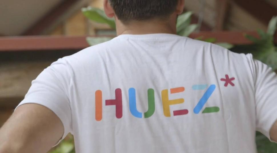
 Huez (via Vimeo).jpg
Huez secures £250k funding - and womenswear on the way
The British cycling brand Huez has managed to secure a quarter of a million pounds in investment using a crowd investment platform, allowing it to expand.
Nearly 250 investor pitched in to fund the brand, which uses advanced sportswear fabrics to create what it says is “a truly stylish range of cycling clothing”.
Since its debut, Huez has partnered with various retailers, which includes The Conran Shop, Matches Fashion, and Velorution. It has also sold apparel in shops in the UK, Europe, and Australia.
Huez said: “We were one of the cycling brands selected by Matches Fashion and since launching on their site have had multiple repeat orders.
“Recently we have agreed wholesale orders for our Spring Summer 2017 collection and received interest from cycling shops in Paris, Vienna, Madrid and London. These include names such as Harvey Nichols and Farfetch which together reach close to 13m users per month.”
The funding will allow 10 new menswear pieces to be developed, along with a new womenswear line.
It will also put funds towards continuous growth of its online strategy, hire a marketing manager to deploy strategy with sponsorship, online ads, print ads and key events. It is also looking to grow its wholesale accounts in the UK and internationally by appointing new sales personnel and deploying a marketing campaign.
The funding round remains open, with an overfunding goal of £500,000.
Latest Comments
- Coolkitty 5 sec ago
Why do people go out and buy a vehicle that takes up the whole road but then wonder why there s problems?
- brooksby 20 min 17 sec ago
I'm not entirely sure that the Orange One understands that concept. Pretty sure that he thinks that "the truth" is whatever he says it is, at any...
- mdavidford 21 min 51 sec ago
His demo unit looks pretty scuffed up, which makes me wonder if it's flapping out and contacting the foot as it passes, which would seem to be......
- BikingBud 27 min 54 sec ago
I had not seen that before but reading it I was shouting that they have handed all the evidence to the prosecution to support the charge. Only to...
- Jem PT 38 min 2 sec ago
And possibly reclaim the VAT on the way back to the UK? At last - a Brexit benefit!
- Surreyrider 1 hour 29 min ago
All good then - go for it. Although maybe the reviewer should be including information like that as it's pretty basic stuff.
- The_Ewan 2 hours 8 min ago
People don't 'need' the big expensive cars either, but people like nice things....
- slc 2 hours 49 min ago
An excellent plan. In fact the Church Road site has parking spaces for rent from time to time, which are snapped up, though not quite as quickly as...
- Tom_77 3 hours 11 min ago
Eventually managed to get my hands on these, ordered from Cycling 2000 (looks like a few other UK shops also have them)....
- Tom_77 3 hours 21 min ago
My brother bought me this mug - no occasion, just "saw this and thought of you".
Add new comment
2 comments
The website annoying and is seriously bargain basement looking, models have that air of pretentiousness about them they can't quite pull off in uninspring designs.
Still, they must be doing something right among the swathes of instagram cycling apparel designers/vendors to get a quarter of a mil in backing. I can't see it though, when most of the others all look far better.
Went to their website, clicked "shop", was instantly confronted by an annoying popup that couldn't be closed without clicking the small X. Closed the website, went elsewhere.
Retailers - if I'm on your website, don't make it annoying. I'm already there, I don't need convincing.