

The 2018 race season has already begun – the Tour Down Under has come and gone – and if you want to know what’s going on in the peloton you need to know who’s who.
Here’s our guide to the kits the big teams are wearing this year.
Ag2r-La Mondiale

AG2R-La Mondiale has switched to Italian clothing brand Rosti and ditched last year’s busy design, which featured one brown sleeve and one blue sleeve. Too far ahead of its time! They go for something altogether more classy in 2018.
They’re still rocking those brown shorts, though (not pictured for reasons of taste). We’re all for breaking convention, but brown shorts! Non!
Astana Pro Team

Astana has neatened up its jersey a little for 2018 and added a yellow band on the left sleeve to match the one on the right – as with AG2R, asymmetry is out.
It’s a ‘yes’ from us.
Bahrain-Merida

Bahrain-Merida has widened the blue band across the chest of its 2018 jersey, and changed the sleeves and collar from blue to red, but it’s a pretty similar overall impression to last year.
This lot don’t look too happy about it, mind. In fact, they look decidedly miserable. Chin up, lads, we think it’s a strong look.
BMC Racing Team

BMC’s kit hasn’t changed all that much for this season although new sponsor Sophos is now represented on a blue collar, which puts a dent in the red, white and black theme.
That fella behind’s not bothered either way, just as long as he gets to finish his cone pyramid before it’s time to clock off.
Bora-Hansgrohe
What a win, congrats @JayMcCarthy1The first Aussie winner of this race #CadelRoadRace pic.twitter.com/jWNbNReBMN
— BORA – hansgrohe (@BORAhansgrohe) January 28, 2018
Chevrons, huh? Cheeky. Germany’s Bora-Hansgrohe has a completely new kit having switched from Craft to Sportful. We need to have a talk about Jay McCarthy’s tash at some stage, though.
Dimension Data

Dimension data has ditched most (not all) of the black from its jersey and goes for a more distinctive white/green combo. We can’t decide whether this is a step forward or a step back. Maybe it’s neither. A solid mid-table performance.
These pics make us think: barber shop wall. Number two at the back and sides, please, leave it a little bit longer on top. Ta.
EF Education First-Drapac p/b Cannondale

The new name is challenging, admittedly, but we’re right behind a bit more pink in the pro peloton. Whether or not it should be teamed up with bright green is perhaps a little more open to question, but you’ve got to take a style risk now and again.
FDJ

Although FDJ is currently racing in the same kit as last year, the team is taking on a new sponsor and will be known as Groupama-FDJ from March. Here’s the new jersey (below).
#ÉquipeGroupamaFDJ pic.twitter.com/WFbXByM3iT
— Equipe FDJ (@EquipeFDJ) January 31, 2018
It has to be said, the boys don’t look wild about it.
Lotto-Soudal

What’s going on here? Like the mullet, Lotto-Soudal’s jersey is business in the front, party in the back.

It looks like they’re channelling an Eddy Merckx-era Faema jersey – which is a Good Thing – but those coloured circles that have been added at the rear, they’re just a bit… uncalled for. They’re out of control.
Mitchelton-Scott

Well, whaddya know? They’ve only gone and changed their name again. This team has so far been Orica-Scott, Orica-BikeExchange, Orica-GreenEdge, GreenEdge Cycling and now Mitchelton-Scott and it has only existed since 2012. The change of name means a new kit, obviously, and they’ve switched from blue to predominantly black. That curious shape on the chest is part of the logo for Mitchelton, a wine, hotels and spa business.
Movistar Team

Movistar Team has had a dark blue jersey decorated with a bright green M since the telecommunications brand began sponsorship in 2011 but that all changes this season – now it’s light blue with a white M. The clothing still comes from Scotland’s Endura and it still looks pretty cool to us. Bold!
Quick-Step Floors
Primera etapa dura y buenas sensaciones. Mañana es la hora de la verdad! Here we go / First tough stage and good sensations. Tomorrow comes the moment of truth! Here we gopic.twitter.com/EvsBMdY7na
— Enric Mas Nicolau (@EnricMasNicolau) January 19, 2018
Quick-Step haven’t gone for a wholesale redesign, they’ve just taken the various elements from last year, given ’em a bit of a shake and left it at that. It kinda works.
Team Katusha Alpecin

Katusha Alpecin has added light blue to the mix for 2018, which gives them a bit of an Aston Villa vibe. Geez, how many riders do they have on this team? That’s a helluva lot of free haircare products to give out. Oh, it’s a ride-out. As you were.
Team LottoNL-Jumbo
#TDU Satisfying comeback @RGUpdate in Australia #PeoplesChoiceAUClassic
https://t.co/OYNOyoVebo pic.twitter.com/2y6Mlwyj00— LottoNLJumbo Cycling (@LottoJumbo_road) January 14, 2018
LottoNL-Jumbo have made a few logo changes and the tops of the shoulders are now yellow rather than black but the 2018 jersey is a similar proposition to last year’s. But hang on a sec! Last year the Lotto ball numbers were 24, 2, 6, 37, 15 and 45. This year they taken the 2 out and stuck a 1 in there (no, really, that’s an actual fact!). Why? This must mean something important. If only we knew what it was.
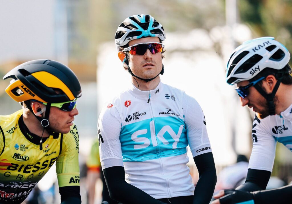
Team Sky

Whoa! What happened to all the black? Sky has dabbled in white kit before but it has gone in with both feet for 2018. Sir Dave Brailsford is going to be up late into the night getting that clean after a muddy Paris-Roubaix. What are the odds on a Persil logo being added at some stage during the season?
Team Sunweb

Unless we’re very much mistaken, that’s the exact same kit Team Sunweb was wearing last year. Cheapskates. Or maybe they’re saving the planet, in which case: well done.
Trek-Segafredo

Trek-Segafredo has switched from Sportful clothing to Santini and ditched black from its jerseys in the process. The pin-stripes are back, though, putting us in mind of Liverpool FC around about 1982-84. You know, Souness, Hansen… Dalglish and Ian Rush slotting them in up front. It’s a good look.
UAE-Team Emirates

UAE-Team Emirates have altered their logos a bit over the past few months but that’s about yer lot. Still, the team has only been around in this form for less than a year, so we’ll let ’em off.


")


, Portland’s world record ambitions, another e-bike brand goes pop + more")


14 thoughts on “2018 UCI WorldTour kits: from the chic to the shocking”
Road.cc should rank pro kit
Road.cc should rank pro kit out of 5 then it’ll build a year on year graph of kit quality/taste. Totally subjective but entertaining
kitkat wrote:
Agreed, I’d like to see the ups and downs of the past few seasons of Trek and OriGreenMitch Scott as two of the teams who’ve barely kept a consistent design for two seasons.
As an aside, is it just the pictures or are ag2r gradually making the brown darker so eventually they’ll just be black shorts?
Sky have switched to light
Sky have switched to light blue and white. Now, where have I seen that colour scheme before? Oh, yeah…
handlebarcam wrote:
Ha ha ha ha ha ha ha ha ha ha ha ha ha ha ha ha ha ha ha ha ha ha ha ha ha ha ha ha ha ha ha ha ha ha ha ha ha ha ha ha ha ha ha ha ha ha ha ha ha ha ha ha ha ha ha ha ha ha ha ha ha ha ha ha ha ha ha ha ha ha ha ha ha ha ha ha ha ha ha ha ha ha ha ha ha ha ha ha ha ha ha ha ha ha ha ha ha ha ha ha ha ha ha ha ha ha ha ha ha ha ha ha ha ha ha ha ha ha ha ha ha ha ha ha ha ha ha ha ha ha ha ha ha ha ha ha ha ha ha ha ha ha ha ha ha…
Actually, aren’t those colours closer to Movistar / Quick Step.
Shame, it was such an excellent joke.
I think a closer up pic of
I think a closer up pic of Puck Moonen is needed please!
Google her if you dont know who she is..
njmoffat wrote:
For some reason I follow her on Intagram, can’t think why.
Redvee wrote:
Hot waffles.
(I’m almost certain we’re not supposed to do this anymore.)
Merida kit just looks classy.
Merida kit just looks classy.
Quickstep looks classically quick
Katusha is burgundy. oof
I waiting to see how Chris pleads before I pass comment or wind on the sky kit.
That TREK kit looks very
That TREK kit looks very elegant on Skujinsh!
#Me too!
#Me too!
I think there’s some decent
I think there’s some decent kits this year.. particualrly like, EF Education First. Quick-Step Floors are reassuringly blue and similar to previous years, Lotto Soudal is very smart but I can’t help but think of Marlbrough fags every time I see it.. Dimension Data looks good too, quite understated in a green and white sort of way.. Bahrain-Merida has the best colours but the kit for me is ruined by a gold scribble in the middle of the shirt I’m sure it signifies something but it means nothing to me, and I sort of ‘object’ to Bahrain and any other country which doens’t treat people/citizens/women/equally or who prosecutes people for expressing opinion.
Worst of the bunch by a country mile, the new FDJ kit, it’s ‘fowl’, they look like ‘cocks’ …French pun…. anyone… no.. I’ll get my coat…
peted76 wrote:
Well at least people in Bahrain actually get prosecuted! in UK at the moment an unsubstantiated Tweet can condemn a person to lose their job, their closest family and ostracised from their community – and not a sniff of due process.
Now that’s what I call progress!
This is all very well, but
This is all very well, but what we’re all really waiting for is the review of this year’s team buses!
(I love the type of humour in the annual kit and bus reviews, be great to see some more articles written in this style)
No conicidence that the two
No conicidence that the two Belgian teams on the WT have the best looking kit…