
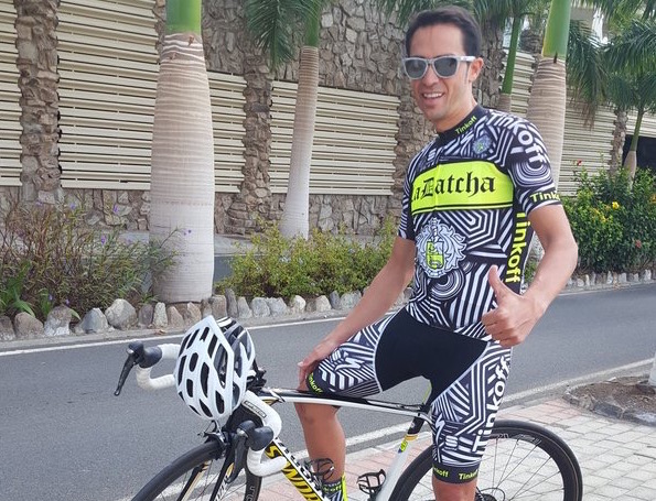
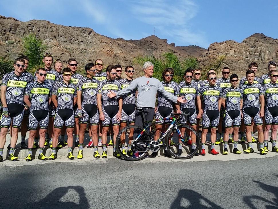
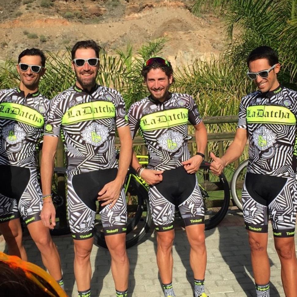
Tinkoff-Saxo has revealed a new training kit called La Datcha that rivals for outlandishness the camouflage design that its riders wore last year.
Remember that camo kit? Of course you do; it’s not one you would forget. But here it is again anyway.
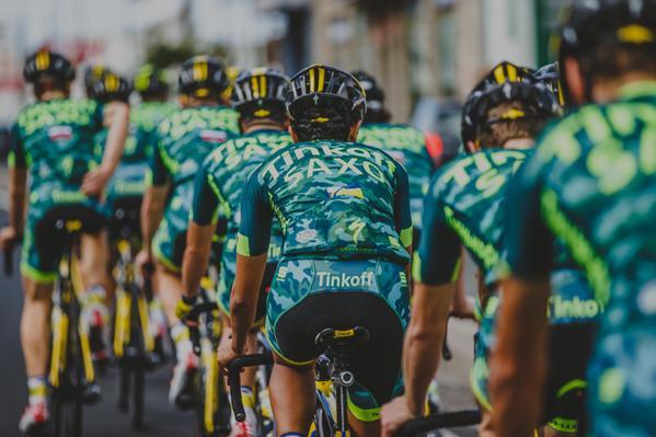
Tinkoff-Saxo first used the new kit from Sportful this week at its training camp in Gran Canaria. We’re not entirely sure what’s going on with the La Datcha design, although it’s certainly – how shall we put it? – busy.
People on Tinkoff-Saxo’s Facebook page haven’t been shy in expressing their opinions.
Here are a selection:
“Tinkoff-Saxo releases a kit that scales new heights of vomitworthiness,” Paul Woolgar.
“This is absolutely disgusting,” Jackson Rees.
And our favourite:
“What the flying fuck ????? The neon was bad enough. That kit is bad enough to make you retire from the peloton,” Louis Perry.
Harsh? What do you think?
Mind you, the La Datcha kit has got people talking, so maybe it has achieved its objective.


17 thoughts on “Tinkoff-Saxo debuts outlandish new kit”
Love it! … mind you I’m not
Love it! … mind you I’m not buying it because I’m short and round and not pro enough to wear team kit, or ‘fluid enough’ to update it every year. But I do like a kit that stands out.
(I loved the camo training kit from last year too – so there, na naa na naa naa!)
Nice
Well I like it. Good to see a bit of a humour injection again. I’d be happy for them to race in it next season Tbh.
They look like they should be
They look like they should be grazing an African savanna, with Alberto on point, looking out for lions.
dafyddp wrote:
Maybe that’s what’s been poisoning those lions recently…(either than or their V02 max is off the lion scale)
It’s a bit Acqua & Sapone….
It’s a bit Acqua & Sapone….
Also, I’m sure it is a diservice to assosiate Saxo Bank with them no, as from 1st Januray, they will just be Tinkoff Team
Perhaps it’s one of those
Perhaps it’s one of those dazzle camouflage patterns, trying to disguise the shape they’re in.
What Flou is out?
Damned just missed the price for worst style tip!
Am I the only one thinking Tinkof being the new Rock Racing?
Dr. Ko
What’s with the big black
What’s with the big black triangle in the, er, gentleman’s sausage area?!?! Weird!
Love a bit of Dazzle camo!
Love a bit of Dazzle camo!
Black triangle is probably because the Sportful BodyFit shorts are engineered with a certain fabric in that part, it’s been a ‘feature’ of the kit for years…
SMDSY .
SMDSY .
.
As an off-beat traning kit
As an off-beat traning kit for a bit of fun, looks OK to me (Shorts though should be either all black or all pattern imo)
I actually prefer their traning kits from the past couple of years to their rather bland race kit.
I’m of the opinion that cycle
I’m of the opinion that cycle kits should be stylish and co-ordinated or utterly god awful so bad it’s good.
Go Tinkoff!!
Love it!
Love it!
Oof! It’s like one of those
Oof! It’s like one of those magic eye pictures – look through and past it for long enough, and the rider gets closer to you as he becomes 3d.
No idea why there’s a gansta-rap-tattoo-inspired bit on the chest.
Why such the strong social
Why such the strong social media reaction? It is just cyclist clothing for a team camp, nobody is getting hurt and nobody is forcing you to wear it or even look at it. Some people just need to hate something to feel better about themselves.
It reminds me of the new
It reminds me of the new Strava Grand fondo Challange Jerseys.
Although not my cup of tea, it is good to see teams doing something different.
This is so ballin, I need
This is so ballin, I need those socks….