

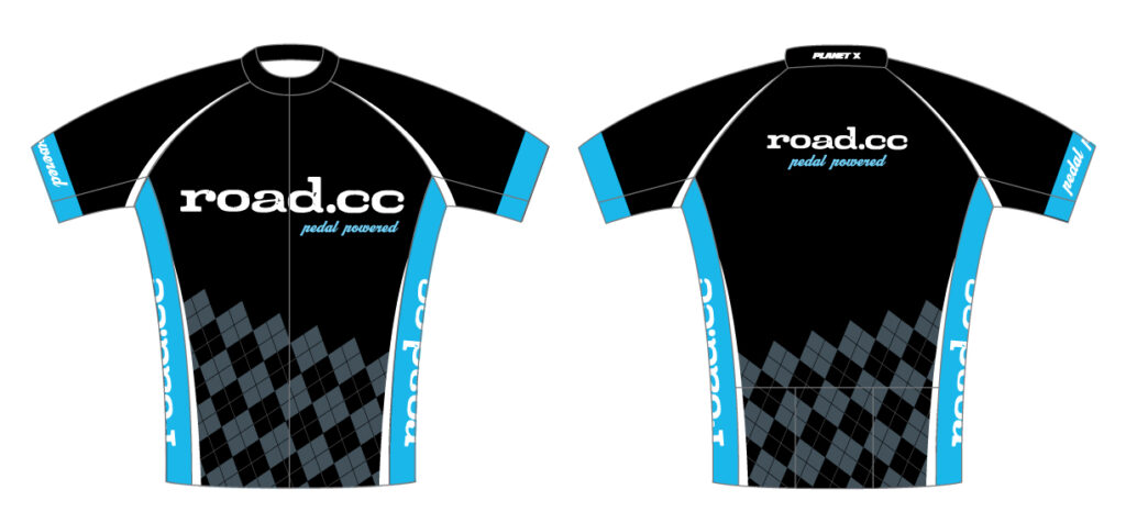
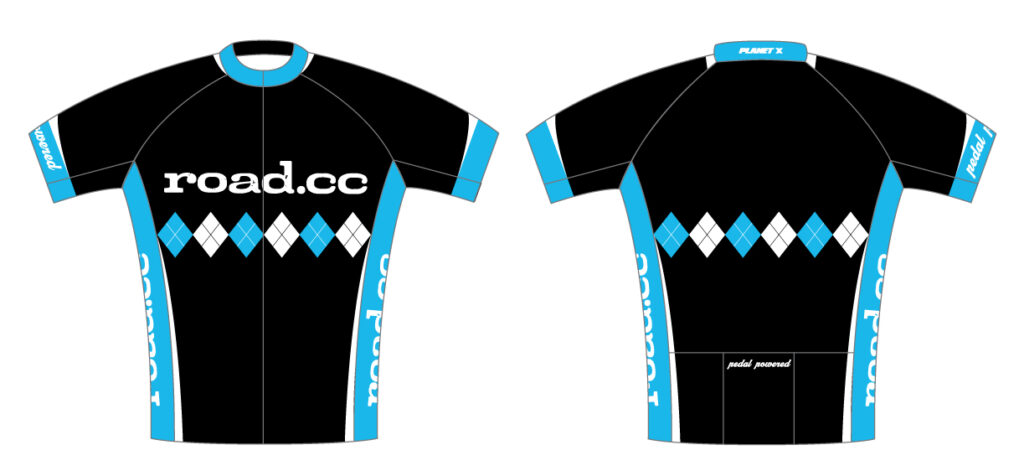
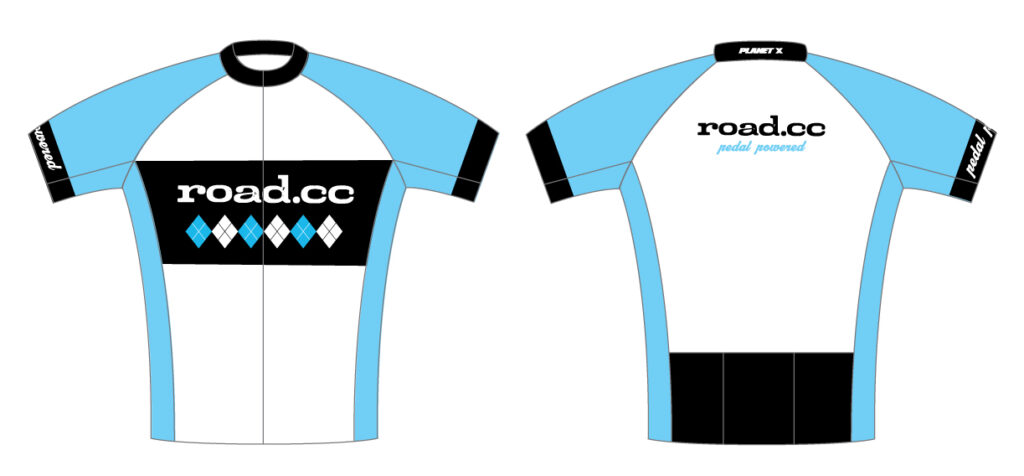


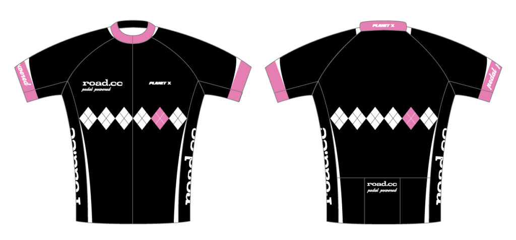
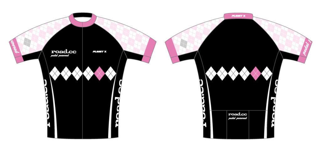
We’ve always said we wanted road.cc to be more like an online club than anything else. That means everyone getting involved, and the latest way to do that is to spout forth on the goodness or otherwise of our mockup of the new road.cc jersey. You have spoken and we have listened… sort of. So now we’ve added some new versions inspired by your suggestions. Vecchiojo’s white piping gets an airing as does his favourite pantone pink and in a fashion mash-up fringe’s retro look meets PK Ripper’s white idea. We’ll probably do some more later too, but for now tell us what you think of this lot.
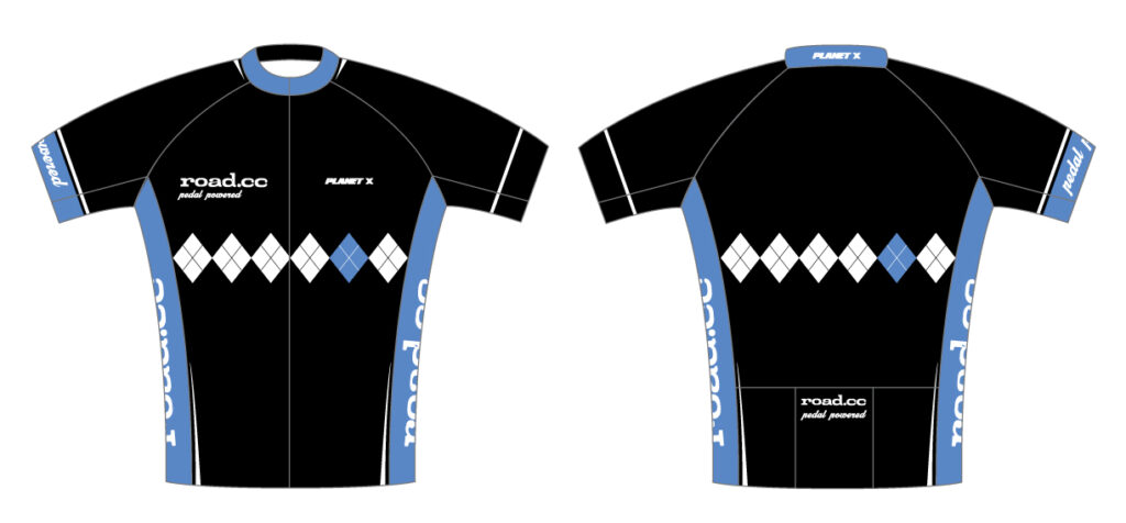
Eagle-eyed members will recognise our crrent favourite as a development of one of the potential Planet X-road.cc jerseys that we stuck on the site not so long ago. It didn’t make it onto the back of the team, but it did get a lot of love, so we’re thinking of making some for the season.Click on it for a closer look: there’s still a bit of our favourite Argyle in there, of course.
Obviously you can’t please all of the people all of the time but we’d like some feedback, so don’t be backward in coming forward! And if you’ve got other designs that you think would work for a road.cc jersey, add them to you comments… ones you’ve found, ones you’ve loved or – even better – ones you’ve scrawled on the back of a fag packet and scanned in.
Your mum always told you that if you haven’t got anything nice to say, it’s better not to say anything. But hey, we’re pretty tough skinned. So fire away*
*You don’t have to say nasty things though. You can be nice too.


")


, Portland’s world record ambitions, another e-bike brand goes pop + more")


41 thoughts on “Updated: New road.cc jersey design – have your say!”
I like it, understated.
I like it, understated. Perhaps you could have road.cc accross the shoulders?
Too much road.cc. Should be
Too much road.cc. Should be quietly stated stylishly not writ large. Othewise tasty. Bit less blue and more blackish perhaps. Argyle is great.
I’d wear that – nice design.
I’d wear that – nice design. You’d pay us to wear it, right?
Yeah, practically Martin
Yeah, practically Martin 😕
Our man in London, has just been in touch to suggest we add in some extra colours in the diamonds coupla different pinks – I’m not sure though.
I think just having black and
I think just having black and blue make it to similar to Sky. Pink is maybe not the right colour but I feel you need some more colour in the design maybe yellow.
See what you mean about Sky,
See what you mean about Sky, we had the colour before them though it’s a carry over from the last jersey and the real colour is lighter than the Sky jersey – closer to the colour of the words in that Rouleur button on the right.
Tricky this fashion business – one thing we might do though is settle on a design and then do it in more then one colour
If you had launched it a few
If you had launched it a few months ago maybe we could have signed Wiggins as he seemed to take so long to decide whether to wear a black/blue jersey or an Argyle one for 2010 – Roadcc would have given him the best of both worlds 🙂
I like it by the way
as it stands i think it looks
as it stands i think it looks a bit ‘meh’ and needs some detailing/jazzing up
a thin white line between the black and the blue on the collar, sleeves, shoulders and down the sides of the torso would ping it up a bit, and the white stripes down the sides would be nicely slimming (not looking at anyone here, obviously), and the addition of another colour would be a welcome thing in my eyes, but only as a very subtle highlight, although not yellow as that would be a bit too much like one of Columbia’s previous incarnations
or to be totally different, the same colours but with the diamonds coming out the bottom of the jersey at an angle and only covering the lower half, a bit like the road.cc sticker
Liking it. Don’t think it
Liking it. Don’t think it needs extra colours, but VecchiJo’s white edging idea would definitely liven it up a bit.
Will there be a sportwool version?
Great… Maybe add a bit of
Great… Maybe add a bit of yellow?
Looks good – my only request
Looks good – my only request is to get someone like Columba to make it up in a Sportswool merino blend.
I’m with the Don of road
I’m with the Don of road styling on this, also can we have Sportwool please?
I’d wear it. Although I
I’d wear it. Although I prefer white to black, killer to wash out though.
Does lack that little spark that would compliment the Road.cc quality
Otherwise…good job.
That’s based on the one of
That’s based on the one of the designs I preferred 😀
I’d definitely wear that if you can make it big enough! 😉
So, next questions.
How soon?
How much?
me …. i want one now, right
me …. i want one now, right now …. excellent
job 😀
when do we get them ????
Following Jo’s suggestions, I
Following Jo’s suggestions, I would agree with his points.
The addition of another colour would also be really good – ideally one of the diamonds on front and back being pink. Off centre, of course.
Like the design, doesn’t need
Like the design, doesn’t need any more embellishment. personally I’de prefer a magila rosa pink to the blue and please please make it out of sportwool.
Argyle is not my favourite
Argyle is not my favourite but I very much agree with the “meh” comment above.
I needs some extra colour(s) – at present it looks a bit flat and, well, boring.
mmm…well i mulled this one
mmm…well i mulled this one over whilst i ate my sardines and greens and i prefer a more simplistic and less jazzy number myself, (i expect thats why Rapha seem to do so well). Anyhow keep the colour down to black plus one other (blue, red, green etc) and keep the diamond Argle strip but make it more ‘classic’ looking perhaps..like this!
what’s with the argyle still?
what’s with the argyle still? That’s so rockshox 2003!
Personally I wouldn’t wear one as despite it being in the same colours as my new bike the colour proportions are in my opinion a bit wrong.
Am very much a fan of understated styling and this one I think would look better with the bulk colour being white as opposed to blue, with the diamonds in blue and red – like the old england football kit. At the moment it all looks a bit “altura commuter” – not a good look!
Yorkshire, it just shows some
Yorkshire, it just shows some continuity with the original road.cc jersey. I think that the arglye works.
I like Fringe’s option, the
I like Fringe’s option, the Rapha-esque style appeals…
make one in merino, and I’d
make one in merino, and I’d buy one. 😉
Perhaps the wording pedal
Perhaps the wording pedal powered on the cuff of each sleeve.
Fringe’s suggestion in merino
Fringe’s suggestion in merino would definitely be something I’d buy (not convinced by sportwool though).
I like the main version and would buy it though I don’t think its worthy of a merino build.
“too jazzy” – 🙂 love it!
4 for me… the pink ones are
4 for me… the pink ones are a bit too “Rapha Condor” for me.
I think if it was going to be
I think if it was going to be pink we would need to go more pink. We are going to do something in merino too, but it’s more likely to be long sleeved full zip and something you could wear on or off the bike.
kit 5, much as i like it, is
kit 5, much as i like it, is too close to the RaphaCondorSharp team kit. not keen on the white on 7, would prefer a band of colour/black all the way round, but out of that new lot i really like 6.
i wonder if FUJI SERVETTO had these problems..”like the light brown skin poo-ish colour”
Don’t forget to make a few in
Don’t forget to make a few in XXL.
How about a charity band on
How about a charity band on the arm like radioshack my vote would be for Cancer Research UK. :B
I was thinking along the same
I was thinking along the same lines as Chris Deacon, £1? to charity for each purchase say.
I would like to see a little pink on it in the argyll pattern perhaps. Quite like the Giro etc but a full on pink is too much. Ibex did a nice jersey with a narrow pink band but for the ladies only 🙁
White can be difficult to clean – and can’t imagine many of us being mistaken for the Sky boys if you go with black & blue though!
well, as it’s all my
well, as it’s all my suggestions in one jersey i have to go for ‘kit6’ 🙂 , it’s different to all the “me too” solid-colour-with-a-band-across-the-middle jerseys out there and asymmetrical is very in this year darlings.
another colour, just for some very subtle detailing work would be nice though. a charity band would be a kind thought too
Like both Kit 6 and Kit 4 –
Like both Kit 6 and Kit 4 – the blue on Kit 4 is the best colour, but the design of Kit 6 just takes it I think…
Oh, and a charity band is a
Oh, and a charity band is a great idea too.
Looks bloody aweful.
If there
Looks bloody aweful.
If there are different colour options I would buy it but not in yucky blue and white!
Ok it’s a cycle jersey but I find I order my stuff aboard as it looks so much better than the naff colours made over here.
How about a competition from the users?
👿
Zaskar wrote:How about a
nothing stopping you posting your own designs here, we’ll mock ’em up 🙂
dave_atkinson wrote:Zaskar
nothing stopping you posting your own designs here, we’ll mock ’em 🙂
Oli wrote:dave_atkinson
nothing stopping you posting your own designs here, we’ll mock ’em 🙂— Zaskar
Sorry guys didn’t mean to sound harsh or mock you guys!
I find the design fine but light blue? how about using colours that are seen by drivers like red or yellow?
Ok I know not all colours are suited for everyone and I would still buy it as long as it is not Brown!
👿
I will come up with a drawing you can mock/up soon! B)
What program will let me replace the colour blue with red or yellow?
I quite like the ones in the
I quite like the ones in the thumbnails with are blue on the left and pink on the right. But you can only click in between them… Embrace asymmetry!
Love the mock up- some people
Love the mock up- some people are just too fussy.How many are going to ask ” does my bum look big in this”. I’ll have one when they arrive. 😀 😀 😀
All good but I like kit 4 the
All good but I like kit 4 the best