

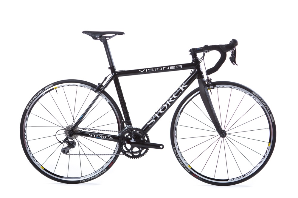
We’re not big ones for telling you about bikes’ new finishes but we thought we’d highlight this one because we’ve not covered the Storck Visioner in much depth before on road.cc.
Storck, as you probably know, is a German brand headed up by Markus Storck. Here’s a video from Eurobike 2012 with Markus telling us about the then new Visioner…
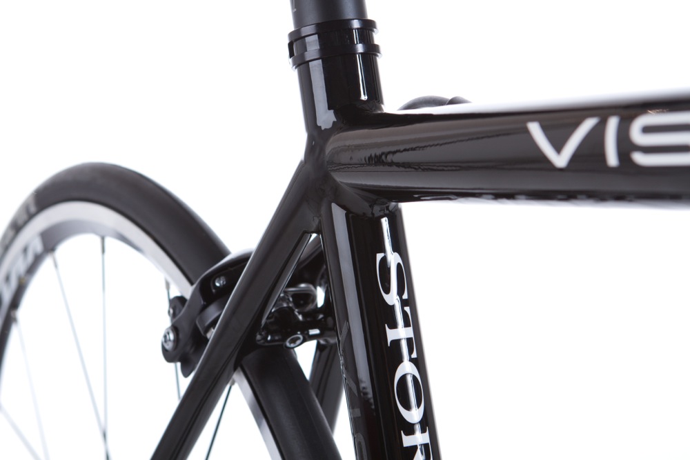
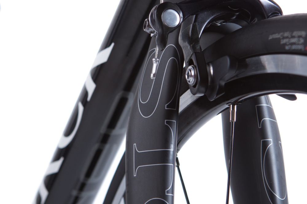
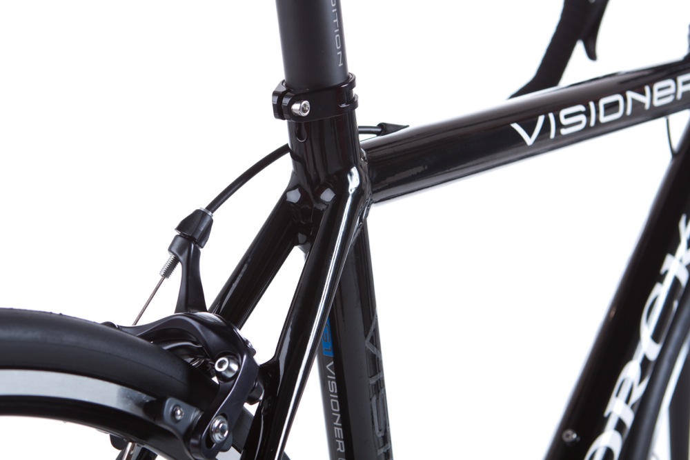
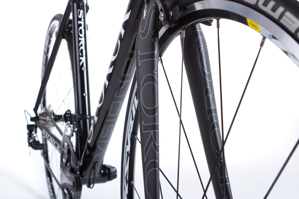
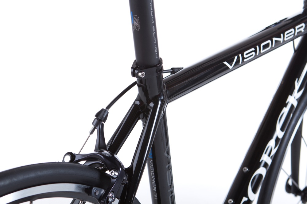
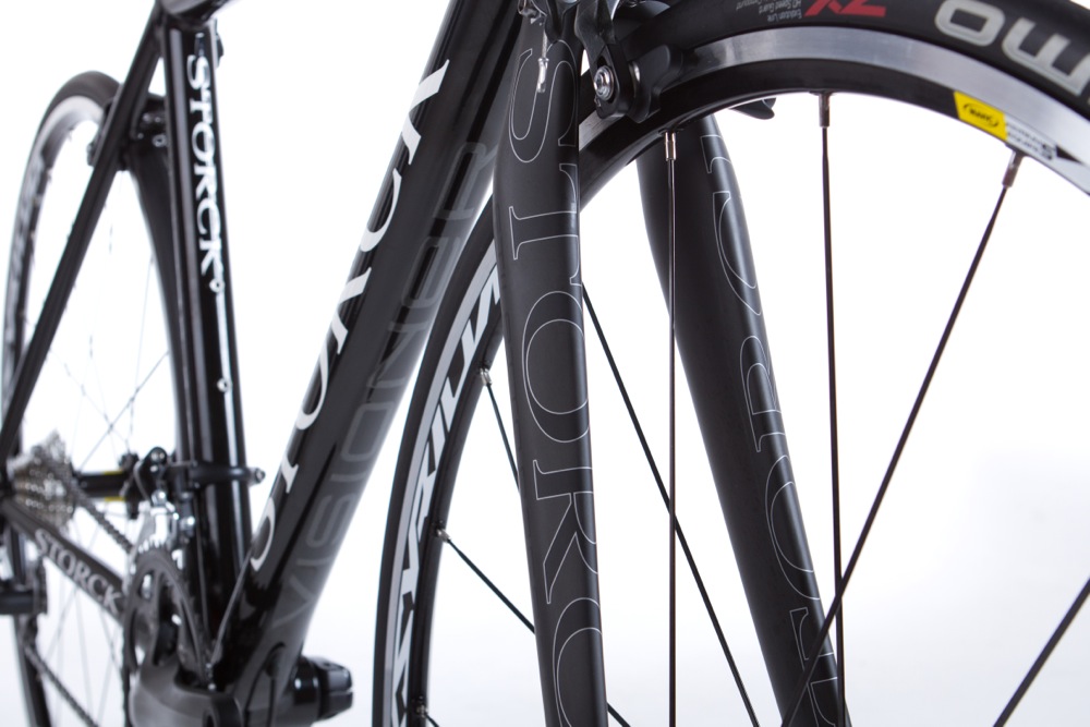
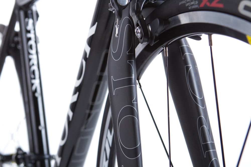
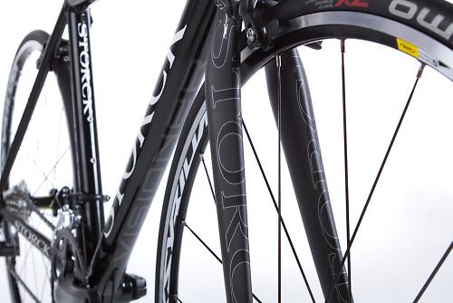
The bike is built around an alloy frame – 7005 double and triple-butted aluminium alloy – with some of the tubes borrowed from Storck’s Scenario Pro and others developed specifically for the Visioner. All the tube junctions are double smooth welded – very neatly done. Storck say that the stays and seatpost have been designed to add comfort to the ride, as has the all-carbon fork (360g).

The Visioner comes with a press-fit bottom bracket and an integrated headset (1 1/8in at both ends of the head tube). The bike is compatible with both mechanical and electronic shifting, the cables running internally whichever system you opt for.
Storck claim that frame weights start at just 1,190g, with a complete bike built up with a Shimano 105 hitting the scales at 7.2kg (15.8lb). The full bike in that 105 build is priced at £1,749.
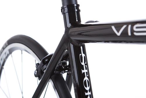
The Visioner is also available as a frameset (frame, fork and headset) for £759. This new finish is called Pearl Black and it looks very, very cool to us.
For more info on the Vision and the rest of the Storck range, head to www.storck-bicycle.cc.


11 thoughts on “Storck’s aluminium Visioner”
looks like a neat job
,
looks like a neat job
,
Nice weight for a 105 build.
Nice weight for a 105 build.
Too expensive for what it
Too expensive for what it is…
Hector Ch wrote:Too expensive
You buy a Storck because you need to own a Storck price is irrelevant.
William Black wrote:Hector Ch
That’s a dumb reason to own one 😀
I’d like one, and I’d say
I’d like one, and I’d say price isn’t too bad when compared to an off the peg mass produced thing like a Specialized tarmac or roobay.
Shame its minging. 1980’s
Shame its minging. 1980’s Storck logo needs to be updated. Different font for name of bike (what is a “Visioner”?) makes my eyes burn.
surly_by_name wrote:Shame its
It’s the one thing I don’t like about Storck is the logo and paint jobs – too garish.
Nobody expects the Spanish
Nobody expects the Spanish Inquisition!
I’m more worried that the name is too close to both the margarine brand and the baby-delivering bird. Could lead to lost sales and confusion. Imagine turning up to the club run astride a 500g tub of marge.
And that spoon/fork thing too, come to think of it. Oh lawyers! Come! Save us from this dilemma!
Yet another bike in Doom
Yet another bike in Doom Black.
*yawns*
Won’t be on my list until they splash a bit of colour about.
:W
yay it’s a black bike
yay it’s a black bike