- News
- Reviews
- Bikes
- Accessories
- Accessories - misc
- Computer mounts
- Bags
- Bar ends
- Bike bags & cases
- Bottle cages
- Bottles
- Cameras
- Car racks
- Child seats
- Computers
- Glasses
- GPS units
- Helmets
- Lights - front
- Lights - rear
- Lights - sets
- Locks
- Mirrors
- Mudguards
- Racks
- Pumps & CO2 inflators
- Puncture kits
- Reflectives
- Smart watches
- Stands and racks
- Trailers
- Clothing
- Components
- Bar tape & grips
- Bottom brackets
- Brake & gear cables
- Brake & STI levers
- Brake pads & spares
- Brakes
- Cassettes & freewheels
- Chains
- Chainsets & chainrings
- Derailleurs - front
- Derailleurs - rear
- Forks
- Gear levers & shifters
- Groupsets
- Handlebars & extensions
- Headsets
- Hubs
- Inner tubes
- Pedals
- Quick releases & skewers
- Saddles
- Seatposts
- Stems
- Wheels
- Tyres
- Health, fitness and nutrition
- Tools and workshop
- Miscellaneous
- Tubeless valves
- Buyers Guides
- Features
- Forum
- Recommends
- Podcast
 The Art of the Jersey montage.jpg
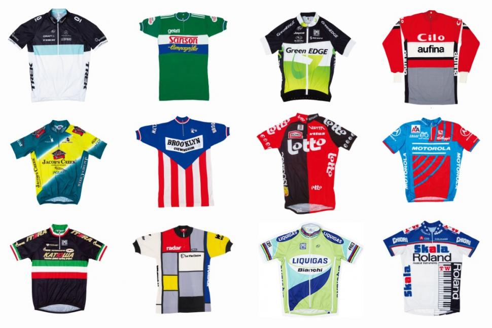
The Art of the Jersey author Andy Storey picks his 12 favourites
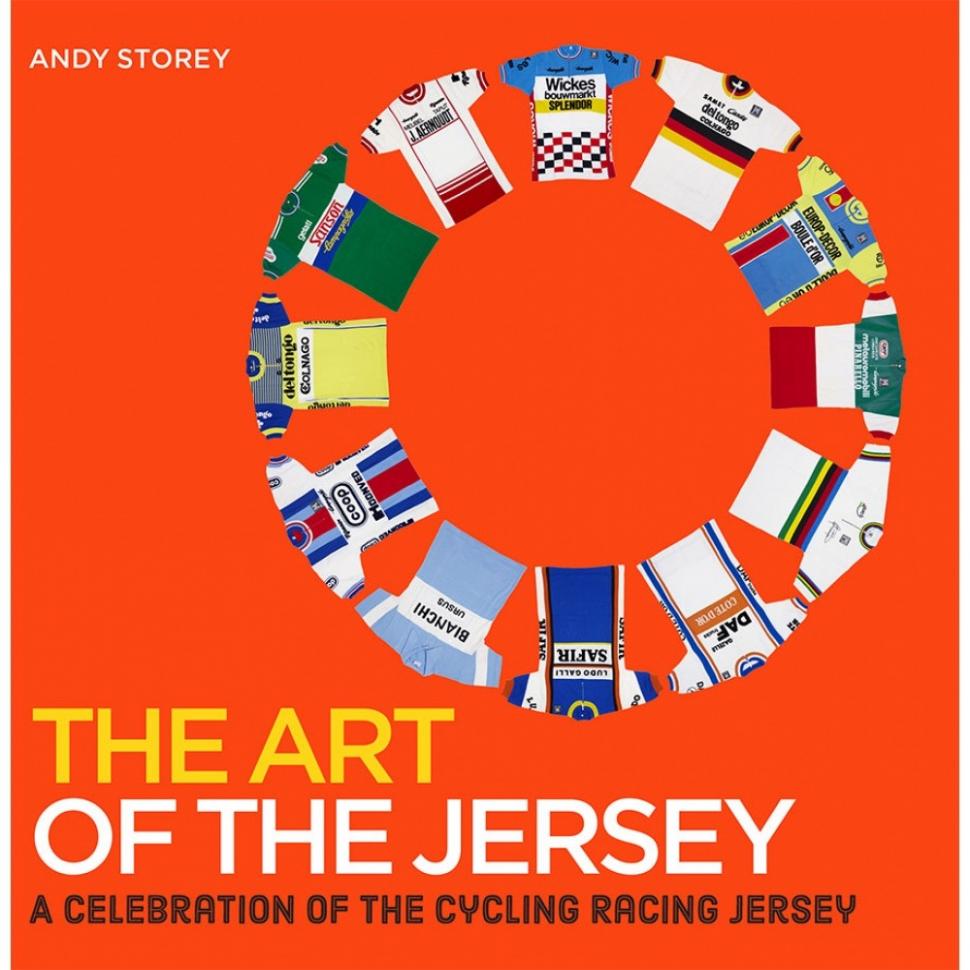
Father's Day is coming up, and if you are looking for a present for a cycling-mad parent (or want to drop a not-too-subtle hint to your offspring), we reckon the recently published The Art of the Jersey book from avid collector Andy Storey of Prendas Ciclismo would make an ideal gift.
Here, Andy talks us through his 12 personal favourites from his collection - they are among more than 200 featured in the book, published in hardback last month by Mitchell Beazley and available online from Prendas Ciclismo here.
Brooklyn Chewing Gum Wool Jersey by Santini (Early Years)
Out of all the wool jerseys I've had the pleasure to photograph, this original wool jersey, made famous by Roger De Vlaeminck, is a beautiful design, especially considering that sublimation printing techniques were not to come along for another 15 years. The stripes were achieved by stitching together panels with the sponsor panel made from white fabric, stitched on to the jersey with the sponsor’s lettering embroidered in black.
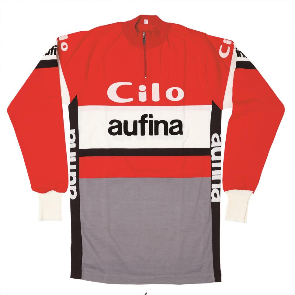
Cilo/Aufina Retro Wool Long Sleeve Jersey by Santini (1980s)
The minimalist and classy design of this wool jersey is superb – instantly recognisable to those who remember the 1980s peloton. Still made of wool, the logos are flocked onto the jersey – a process that allowed more complex logos than embroidery – but was prone to failure after repeated washes.
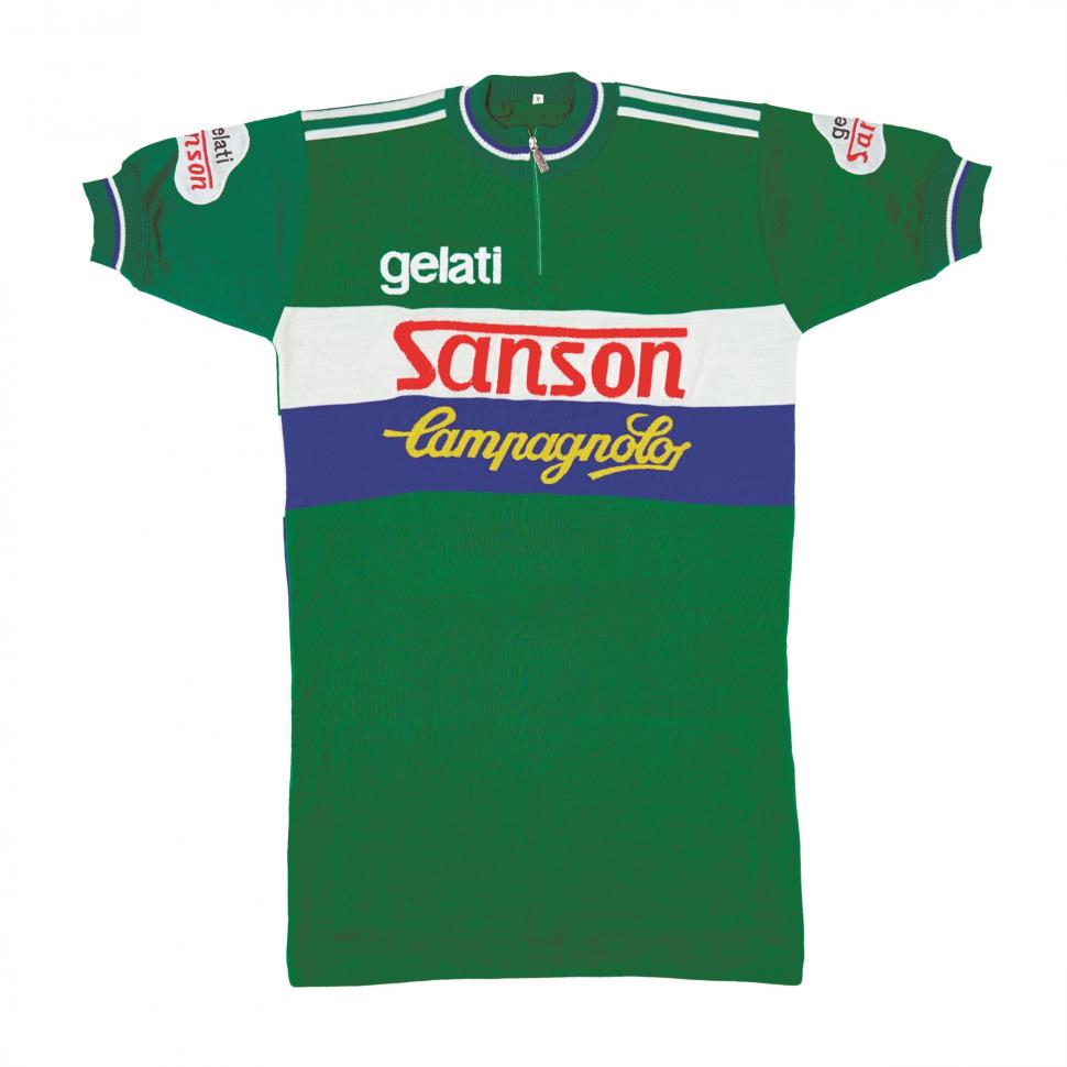
Gelati Sanson/Campagnolo Wool Jersey (1980s)
Inextricably linked to the imposing figure of Francesco Moser thundering across the cobbles, this iconic Sanson jersey is a great example of how a simple, yet striking design can stand the test of time. The deep green colour and style of the jersey no doubt influenced Sir Paul Smith when he designed the “Grand Départ” celebration jersey for the 2007 Tour de France.
La Vie Claire/Radar/Wonder Wool Team Jersey (1980s)
Pietro Santini's favourite jersey design of all time, this jersey was created at the same time that the pro teams were swapping from wool/acrylic jerseys to modern polyesters. It was constructed using several different panels of wool, stitched together to provide the geometric Mondrian-inspired pattern.
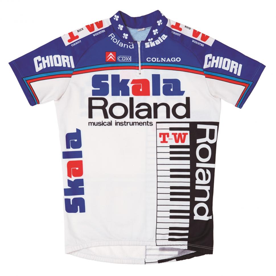
Skala/Roland 1987 Team Jersey (1980s)
This jersey probably comes as a surprise to some being in a "top 12" list of jerseys, but it's the memories that it evokes for me. When I first started riding on the road, I remember a fair few club riders wearing this jersey design at the end of the eighties, the big keyboard on the front making it stand out in a way unique to that decade.
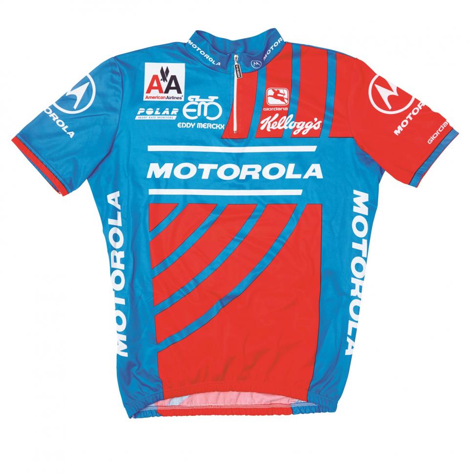
Motorola/Eddy Merckx 1993 Team Jersey (1990s)
The design of this jersey has always been a personal favourite, perhaps because the colour-coordinated Eddy Merckx MX-Leader bikes made from Columbus tubing were always popular in our house. While in-race communication with radio is now commonplace, it was the Motorola team that broke this technology, largely thanks to the technical expertise of their main sponsor. I know, revelations of doping have brought Lance Armstrong from hero to zero in recent years, BUT the way he broke away from the peloton into in the 95 Tour as a tribute to his late team mate Fabio Casartelli – will stay with me for ever.
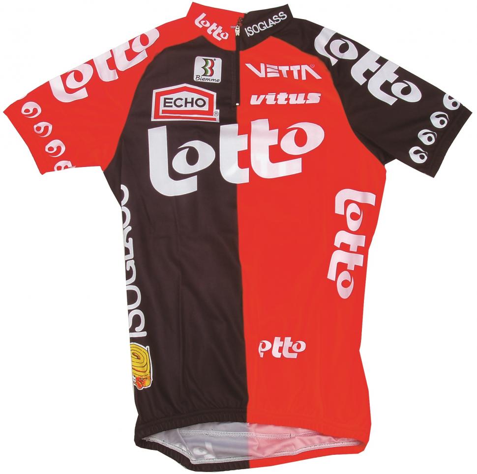
Lotto/Isoglass/Vitus 1995 Team Jersey (1990s)
The simplicity of this Lotto team jersey is striking. The bold red, black, and white colour scheme and distinctive logos looked great in the peloton. This is the 1995 version, but it reminds me of the Andrei Tchmil’s win in the epic 1994 edition of Paris–Roubaix.
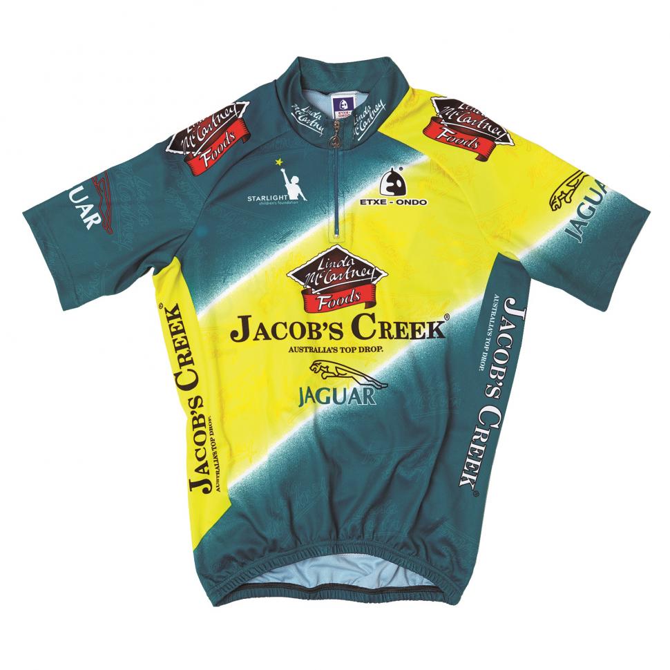
Linda McCartney/Jaguar/Jacob’s Creek Jersey by Etxeondo (2000s)
Despite a stage win by David McKenzie in the Tour Down Under, wearing his new-look kit by Etxeondo, the team then went into free-fall with news that none of the sponsors had formally agreed terms with the team management. This left all the riders (including Bradley Wiggins who was just starting his road career) and support staff without jobs.
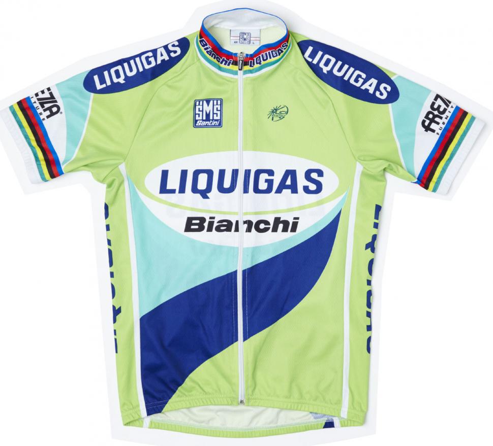
Liquigas/Bianchi S/S Jersey with World Champion Bands (2000s)
This jersey was commissioned by Prendas Ciclismo to allow fans of “Super Mario” to enjoy his season with the Italian super-team Liquigas/Bianchi. The colour scheme of the team’s kit was a combination of the two lead sponsors’ corporate colour palettes, that's right, green is my favourite colour!
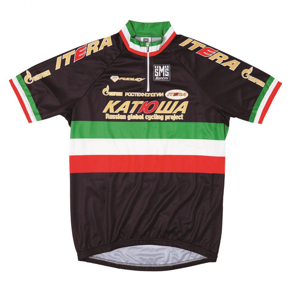
Team Katusha/Italian Special Edition 2009 Jersey (2000s)
In December 2009, Santini produced a one-off skinsuit for Filippo “Pippo” Pozzato to wear in a charity cycle-cross race, “Move to Improve”, which was organized by Tom Boonen and Wilfried Peeters in Mol, Belgium. Pozzato later wore the kit in the 2010 edition of Paris–Roubaix as a tribute to the late Franco Ballerini.
Leopard-Trek 2011 Team-Issue Aero Jersey (2010s)
Many modern professional cycling teams have up to 30 sponsors, each wanting their logo in a prominent position on the team’s clothing to get some return for their often considerable investment. I know how tough this can be having been involved with the design process myself – this year with the women's Drops Cycling Team. Leopard-Trek bucked this trend – using three colours and a minimal number of logos, the design of this 2011 aero jersey was seen by many as the correct way to do it.
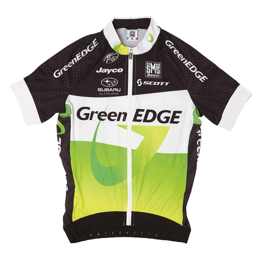
GreenEDGE-Scott 2012 Aero Team Jersey (2010s)
This aero jersey was released for the newly formed GreenEDGE team just after the Tour Down Under. Seemingly taking a design lead from the Leopard/Trek jersey, the design team at Santini produced this clean, elegant kit which went on to win Milan–San Remo thanks to Simon Gerrans (wearing the Australian national champion’s version of the jersey). Later in the 2012 season, Orica signed up as headline sponsor and the team created a new jersey which was not as eloquent in my opinion.
Prenda Ciclismo sells a comprehensive range of retro jerseys including three of those featured here - Brooklyn, Cilo/Aufina and La Vie Claire.
All pictures courtesy Andy Storey and Mitchell Beazley.
Simon joined road.cc as news editor in 2009 and is now the site’s community editor, acting as a link between the team producing the content and our readers. A law and languages graduate, published translator and former retail analyst, he has reported on issues as diverse as cycling-related court cases, anti-doping investigations, the latest developments in the bike industry and the sport’s biggest races. Now back in London full-time after 15 years living in Oxford and Cambridge, he loves cycling along the Thames but misses having his former riding buddy, Elodie the miniature schnauzer, in the basket in front of him.
Latest Comments
- Joe Bloggs 32 min 39 sec ago
I suppose journalists can just about be forgiven for not knowing the difference between CdA and Cd but supposed Engineers can't. CdA is NOT the...
- ktache 1 hour 9 min ago
There is a pHd student at work who has an Adidas backpack in reflective iridescence, looks oil slicky in the day. I love both oil slick and...
- jrg_uk 1 hour 10 min ago
I think what you say has some sense to it (for WBD)....
- Simon E 2 hours 19 min ago
A generation (or more) of cycling fans owe a huge amount to Gary Imlach and the C4 / ITV teams for their cycling coverage on TV, especially Gary's...
- matthewn5 3 hours 30 min ago
A club member had just had his 12 speed Shimano Hollowtech cranks fail... same way that the 11 speed cranks failed.
- MattieKempy 3 hours 44 min ago
Currently watching the Cyclocross Worlds on www.Sporza.be using my vpn, which I have anyway, free through my bank account. OK, so it's in Dutch,...
- chrisonabike 4 hours 15 min ago
EDIT - Cycle Happy got there first!...
- rickiecheese 5 hours 16 min ago
An update regarding this path....
- tony.westclassics@live.co.uk 6 hours 16 min ago
Theres no boubt about it, this bloke is the kiss of death
- don simon fbpe 6 hours 30 min ago
As you agree with me, I don't understand your point.



Add new comment
9 comments
If I could only own one cycling jersey it'd be the the Vino-4-ever top with the man's photo on. So pro.
2 (1).jpg
Some nice choices. I've still got my La Vie Claire top in the attic somewhere.
Top book, got it for my birthday.
Thanks - a great recollection of designs and the memories they evoke. One of the most frustrating challenges for desigers in any medium, is to get a stack of company logos to sit alongside each other - cycling jerseys are clearly no exception!
This also emphasises how polished and media-savvy teams like Sky and Movistar are.
Is there the wrong picture for the Liquigas jersey? The description doesn't match the pictured jersey at all, no green, no world champion bands.
Good spot, we received the wrong one, being updated imminently.
Thanks for making the amendment Simon.
Glad the correct jersey is now in place.
Andy
Very subjective*. The Leopard Trek one is very crisp and set a bit of a trend and I have that one, but Linda McCartney?!
*(ie. wrong)
Hi
Thanks for reading the article.
Didn't say they were the best. They are simply my own personal favourites.
Andy