

- News
- Reviews
- Bikes
- Accessories
- Accessories - misc
- Computer mounts
- Bags
- Bar ends
- Bike bags & cases
- Bottle cages
- Bottles
- Cameras
- Car racks
- Child seats
- Computers
- Glasses
- GPS units
- Helmets
- Lights - front
- Lights - rear
- Lights - sets
- Locks
- Mirrors
- Mudguards
- Racks
- Pumps & CO2 inflators
- Puncture kits
- Reflectives
- Smart watches
- Stands and racks
- Trailers
- Clothing
- Components
- Bar tape & grips
- Bottom brackets
- Brake & gear cables
- Brake & STI levers
- Brake pads & spares
- Brakes
- Cassettes & freewheels
- Chains
- Chainsets & chainrings
- Derailleurs - front
- Derailleurs - rear
- Forks
- Gear levers & shifters
- Groupsets
- Handlebars & extensions
- Headsets
- Hubs
- Inner tubes
- Pedals
- Quick releases & skewers
- Saddles
- Seatposts
- Stems
- Wheels
- Tyres
- Health, fitness and nutrition
- Tools and workshop
- Miscellaneous
- Buyers Guides
- Features
- Forum
- Recommends
- Podcast
OPINION
Just. Get. It. Right. #3

Tue, Mar 30, 2010 13:50
13
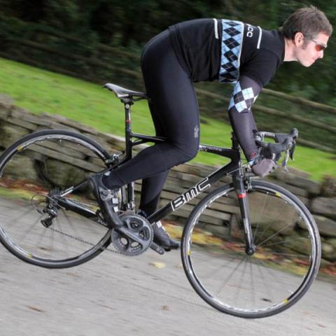
 BicyclingBuyersGuideFAIL.jpg
Right then, we're the world's leading bike magazine, because it says so on the cover, even though we're aware that it doesn't actually mean anything it sounds pretty good.
Anyway, it's the annual "Buyer's Guide" issue and that's quite a big deal so we need a smart bike for the cover, make it a road bike as they're the big thing at the moment, no-one's buying mountainbikes any more, make it a fast and expensive one and make it Italian, that'll make it seem exclusive and exotic and aspirational.
Now, if you could just photograph it from the wrong side please that would be a fabulous schoolboy error and cast doubt over the validity of the contents perfectly. And while you're there, make sure there's some ahead spacers above the stem so we look like complete amateurs, that would be great. Thanks.
Fail squared.
Jo Burt has spent the majority of his life riding bikes, drawing bikes and writing about bikes. When he's not scribbling pictures for the whole gamut of cycling media he writes words about them for road.cc and when he's not doing either of those he's pedaling. Then in whatever spare minutes there are in between he's agonizing over getting his socks, cycling cap and bar-tape to coordinate just so. And is quietly disappointed that yours don't He rides and races road bikes a bit, cyclo-cross bikes a lot and mountainbikes a fair bit too. Would rather be up a mountain.
More Opinion


Latest Comments
- Rendel Harris 4 min 26 sec ago
I'm sure that's true in some cases, I'm thinking of instances where the works necessitating the contraflow are quite small and the road is straight...
- open_roads 10 min 43 sec ago
It's not the whole story though. Reduced profit may also reflect increased investment in the business e.g. factory / equipment / research /...
- ritxis 25 min 49 sec ago
Shimano has not launched anything...the next thing will be the GRX Di2 12....what is now just a patent as it publishes from time to time (just...
- perce 26 min 4 sec ago
Agreed. Although sadly there is such a thing as ''too many bikes I really like but can't afford''.
- cyclisto 1 hour 34 min ago
Agree. 25km/h is a decent speed to travel on a bicycle with skinny tires and uncertified users, that is why e-bikes are wisely regulated (at least...
- David9694 1 hour 51 min ago
How to catch the bus. There's also one about getting off it. If I was going to France or Gernany I guess there'd be no shame in reading up on how...
- brooksby 1 hour 56 min ago
"Sand People always ride single file, to hide their numbers."
- Rezis 2 hours 16 min ago
Would love one, but especially on our rural roads wouldn't feel safe being that low and below the line of sight of motorists in the tall grass...
- antigee 2 hours 17 min ago
Yes you can just see the give way sign and markings in the photo - personally at that distance from the junction I would be riding primary to make...
Add new comment
13 comments
Pretty much, and as therevokid says above there is an engineering reason to have one spacer above, also it does at least leave you the option of a bit of height adjustment. I suppose that on a race bike it comes down to having that 'pro' look with no superflous weight and a perfectly dialled in racing position.
Most test road bikes normally come in with two or three spacers - as they would be sent to a shop, and usually, but not always, with the spacers below the stem cos it looks 'neater' giving the reviewer the option of tweaking the position to suit - which can often mean the bike will be ridden with the spacers above the stem.
Personally I don't have any problem with a bit of above spacer action, but then I'm the sort of person that leaves the laces on their trainers unnecessarily long because they came that way and because if I cut them I will inevitably find myself in a situation in which a long trainer lace would prove vital.
Scuse my ignorance but what's wrong with having spacers above the stem? Is it purely aesthetic?
I'd expect review bikes, which they get passed around several publications, to have spacers above the stem when they're setup for some journalists.
the above stem spacer is to even the stem's pinch bolt
loads across the steerer evenly .... which is fair
enough in an engineering way ... but the non drive
side !!! .... oh dear, oh dear, oh dear .... it'll be
small ring and half way up (or down) the cassette next !
Easton advise on fork installation instructions for 10mm spacer above stem.
Just checked pics of 5 pro bikes and they all have 10mm spacer on top
Mmmmm! Cow Gum. And they wonder why designers are all weird, like?
And if you weren't very careful with your cow gum rubber, you'd have had messy bits around the text too, eh Nick?
A cover that important at a big publisher might well be designed in a different department by someone who isn't overly knowledgeable (or even care) about bikes. So they would just go with the right composition. Which is all the more criminal then to arrive at a cover so........meh! as they say on the interwebs.
Back in the old days, of course, you could reverse a transparency and have the chainset appearing on the left which really is the ultimate cock-up. Guess who's done that?
ah, maybe they were trying to break the mould, make a statement… like an art gallery turning the pictures to the wall… not sure what sort of statement that would be, but I'm not the intellectual sort
Ooh, the wrong side, that's terrible. And spacers above the stem, even worse.
What idiots, not to have done what everyone else does.
Hahaha brilliant (as in brilliantly rubbish)
Lennard Zinn advises you should always have at least one spacer above the stem, can't remember why. So that isn't completely wrong but non-drive side photo...definitely amateurs!
thats the best one yet!
obviously their cut and paste head honcho was off that day and they left it to the intern.