

- News
- Reviews
- Bikes
- Accessories
- Accessories - misc
- Computer mounts
- Bags
- Bar ends
- Bike bags & cases
- Bottle cages
- Bottles
- Cameras
- Car racks
- Child seats
- Computers
- Glasses
- GPS units
- Helmets
- Lights - front
- Lights - rear
- Lights - sets
- Locks
- Mirrors
- Mudguards
- Racks
- Pumps & CO2 inflators
- Puncture kits
- Reflectives
- Smart watches
- Stands and racks
- Trailers
- Clothing
- Components
- Bar tape & grips
- Bottom brackets
- Brake & gear cables
- Brake & STI levers
- Brake pads & spares
- Brakes
- Cassettes & freewheels
- Chains
- Chainsets & chainrings
- Derailleurs - front
- Derailleurs - rear
- Forks
- Gear levers & shifters
- Groupsets
- Handlebars & extensions
- Headsets
- Hubs
- Inner tubes
- Pedals
- Quick releases & skewers
- Saddles
- Seatposts
- Stems
- Wheels
- Tyres
- Health, fitness and nutrition
- Tools and workshop
- Miscellaneous
- Buyers Guides
- Features
- Forum
- Recommends
- Podcast
news
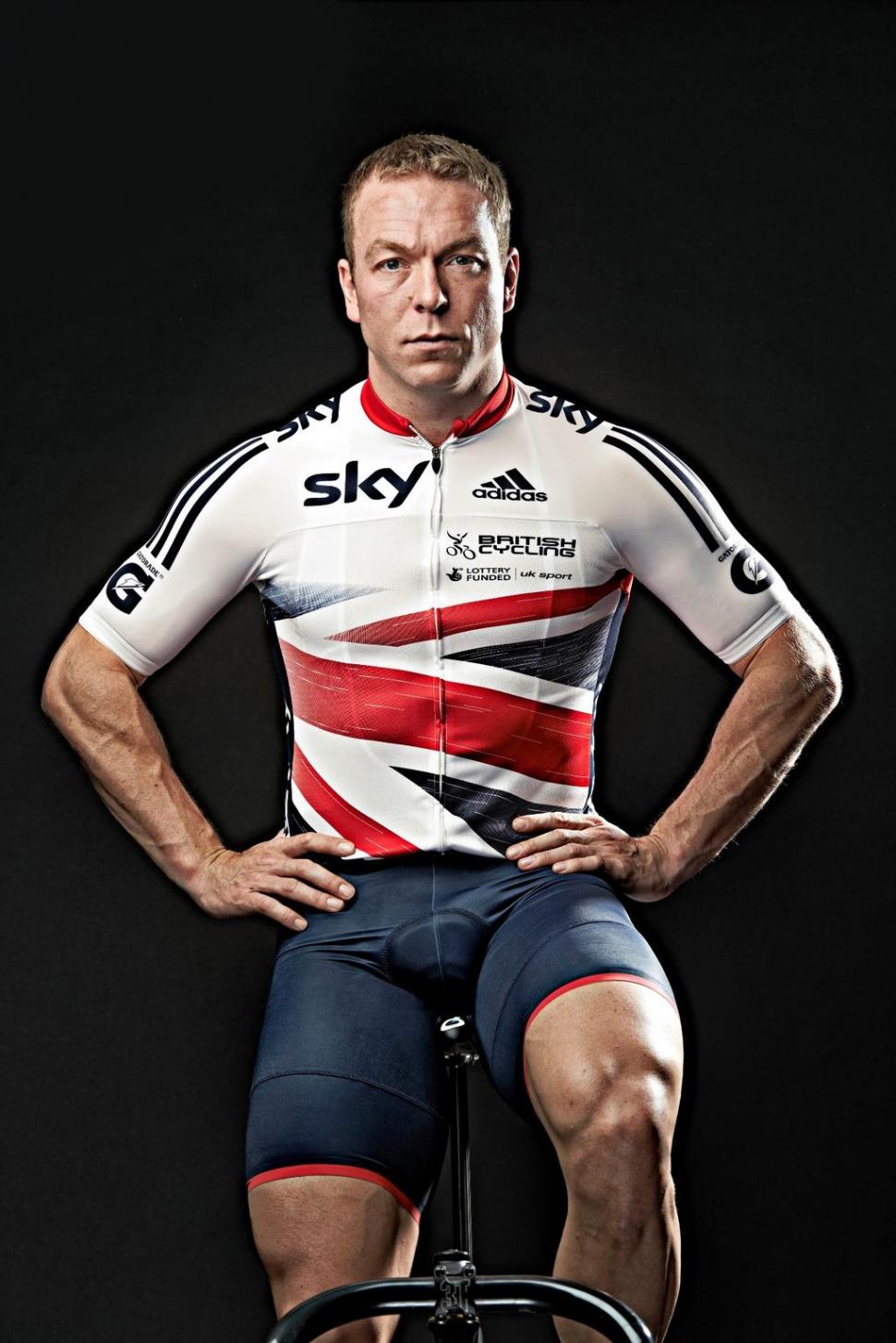

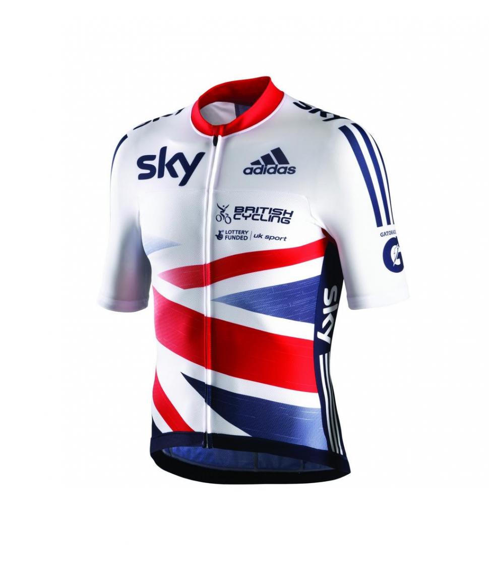
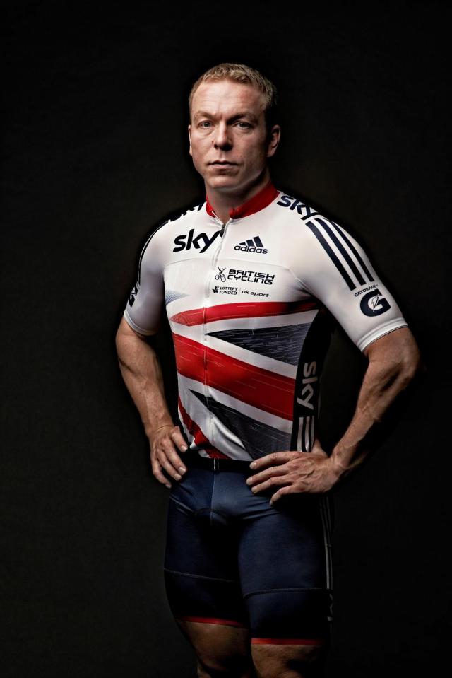
British Cycling and adidas unveil 2013 Great Britain jersey (+ Gallery)
German sportswear giant adidas may have lost the Team Sky gig, but they still supply the kit for the Great Britain team and today have unveiled the 2013 version of the kit, described as “the most innovative ever launched,” which has a strong influence from the one-off number Stella McCartney designed for last year’s Olympic and Paralympic Games in London.
The outgoing kit was based on a union flag design with bright blues and reds and minimal use of white. While McCartney’s singular take on the union flag for London 2012 has gone – it’s back to the familiar colours here, rather than two separate shades of blue – the red and blue, like in the kit ridden to gold medal success last summer, are deeper shades compared to the standard kit it replaces.
The kit could well provoke controversy among flag purists, however… that larger white space above, not below, the arm of the St Patrick’s Cross [the red ‘X’ on the union flag] at the bottom of the jersey means that the flag is upside-down, or back-to-front, depending which way you look at it.
Vexed vexillologists we suppose could always buy a jersey, stick it on and model it in front of a mirror, restoring the flag to its rightful design and, hopefully, a smile to their faces.
It's worth appreciating though that this isn't a flag designed to be flown from a mast or flagpole - it's a cycling jersey, and a fair bit of artistic licence is therefore permissible.

Available to buy from February – it will be formally launched at the London Cycle Show later this month – the kit represents the fruit of months of collaboration between British Cycling and adidas, and given the reference to its testing on the UCI Pro Tour [actually the WorldTour nowadays – ed] has clearly also had input from Team Sky, which was supplied by adidas in its first three years in the peloton.
According to adidas,
The new look team kit is the most innovative ever launched, with the new design combining the aerodynamics of time trial skin suits with the comfort of elite stage race jerseys.
The key innovation feature within the new adistar British Cycling range is the bolero – a one piece aerodynamic leading edge – just like the front of an aeroplane’s wing, designed to deliver maximum efficiency and speed for the rider.
With certain items being vigorously tested over the past two years on the UCI Pro Tour peloton, the new range combines the best of adidas innovation with elements of classic Italian manufacturing and reflective designs to enhance visibility. The range will comprise elite level versions with a replica line up, allowing for fans of the team to experience the same technologies and design features during their ride.
The latest formotion patterns and ClimaCool technologies are incorporated to ensure optimal movement and comfort for the wearer. Every detail is taken care of and elastic grippers feature across the range to ensure that the apparel doesn’t slip out of place.
The new kit marks a new chapter in a longstanding partnership spanning seven years, during which adidas have provided British Cycling with performance kit that has helped contribute to an unprecedented period of success for the team, with 26 Olympic medals, 42 Paralympic medals and 52 World Champions.

Simon joined road.cc as news editor in 2009 and is now the site’s community editor, acting as a link between the team producing the content and our readers. A law and languages graduate, published translator and former retail analyst, he has reported on issues as diverse as cycling-related court cases, anti-doping investigations, the latest developments in the bike industry and the sport’s biggest races. Now back in London full-time after 15 years living in Oxford and Cambridge, he loves cycling along the Thames but misses having his former riding buddy, Elodie the miniature schnauzer, in the basket in front of him.
Latest Comments
- SamSeed 36 sec ago
My 6KU, replaced everything but the front chainring over the past 5 years.
- froze 1 hour 57 min ago
This was a very good listing of bikes for under 1,000....
- Hirsute 5 hours 18 min ago
Radar tells me their closing speed, if they are slowing and how far away. Then I decide to say a prayer. The change of light pattern is incidental.
- lonpfrb 5 hours 38 min ago
Quite so, which is why our village 20mph zone covers the whole residential extent. Of course, enforcement is another thing..
- lonpfrb 6 hours 4 min ago
No, that's very doubtful while proper testing would be fully destructive.
- don simon fbpe 7 hours 18 min ago
What's wrong with dropping down on to the Millenium Bridge, or the swing bridge, then the brief, but satisfying climb back up the hill? #training....
- chrisonabike 7 hours 59 min ago
The relatives might of course disagree, but in general I'd countenance a relatively light sentence* if only we could fix it so that those who...
- ktache 8 hours 39 min ago
Id forgotten that I got a second hand set of project two's for my getting to work bike over twenty years back.
- Veganpotter 9 hours 36 min ago
My bet is that all these tires popping off are from people with bad pressure gauges or they're simply just putting too much air in on purpose. ...
Add new comment
33 comments
But flying a flag upside down is the international sign for distress which may apply for most bike rides
For me although it looks the wrong way I think that it is ok , because it looks as if the jersey is designed to be viewed as if it's moving forward.
Its the same with patches on Military uniforms, they put the flags back to front to show that they do not retreat. The american Flag looks really weird.
Missing the point here. Soon it will be picked up by the media. FREE advertising for Adidas. Kit will then sell in it's thousands as kid request one to replace their outdated Man. U. kit.
Pages