

- News
- Reviews
- Bikes
- Accessories
- Accessories - misc
- Computer mounts
- Bags
- Bar ends
- Bike bags & cases
- Bottle cages
- Bottles
- Cameras
- Car racks
- Child seats
- Computers
- Glasses
- GPS units
- Helmets
- Lights - front
- Lights - rear
- Lights - sets
- Locks
- Mirrors
- Mudguards
- Racks
- Pumps & CO2 inflators
- Puncture kits
- Reflectives
- Smart watches
- Stands and racks
- Trailers
- Clothing
- Components
- Bar tape & grips
- Bottom brackets
- Brake & gear cables
- Brake & STI levers
- Brake pads & spares
- Brakes
- Cassettes & freewheels
- Chains
- Chainsets & chainrings
- Derailleurs - front
- Derailleurs - rear
- Forks
- Gear levers & shifters
- Groupsets
- Handlebars & extensions
- Headsets
- Hubs
- Inner tubes
- Pedals
- Quick releases & skewers
- Saddles
- Seatposts
- Stems
- Wheels
- Tyres
- Health, fitness and nutrition
- Tools and workshop
- Miscellaneous
- Buyers Guides
- Features
- Forum
- Recommends
- Podcast
news


Trek Project One competition: the shortlist
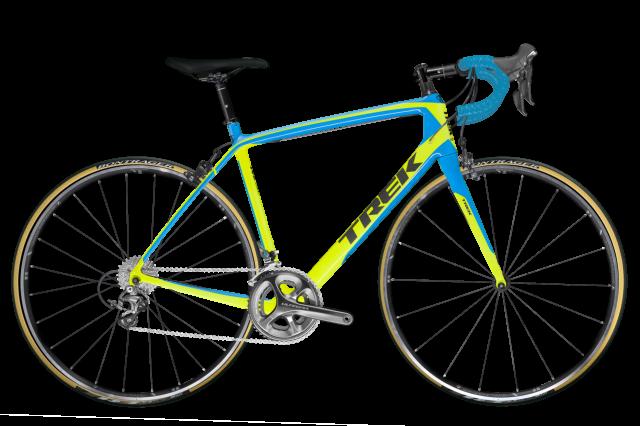
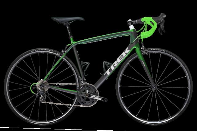
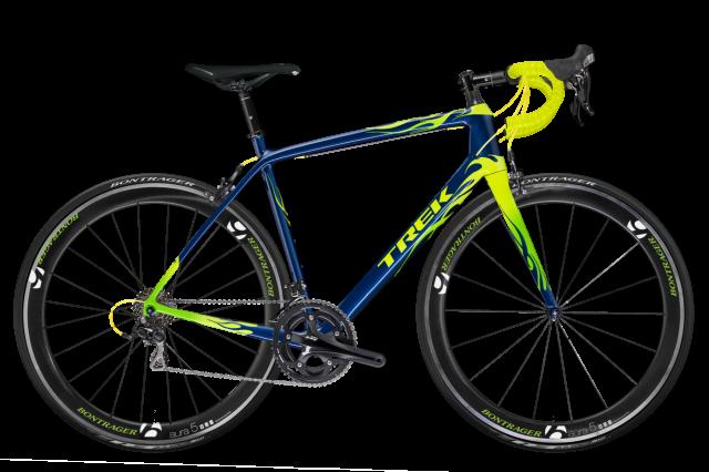
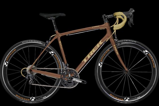
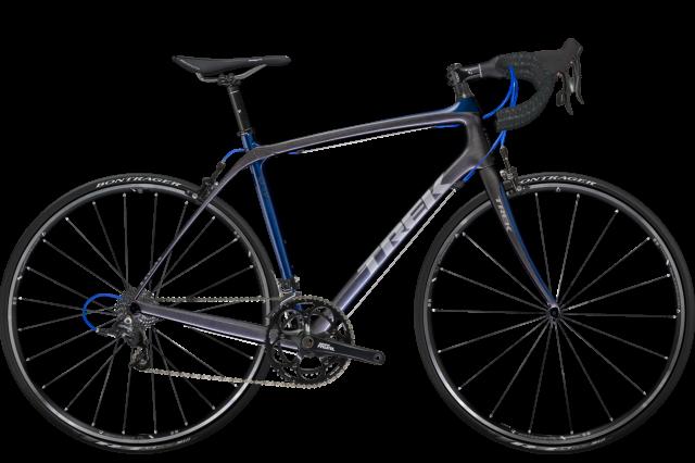
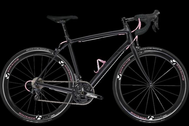
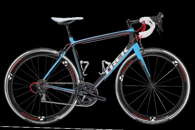
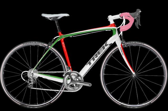
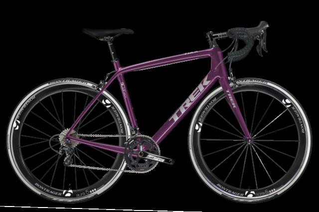
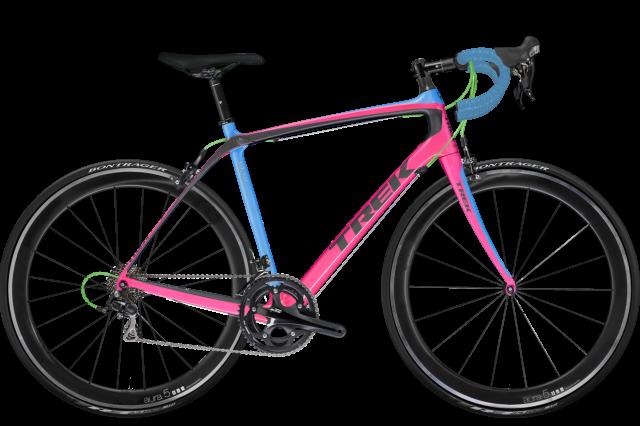
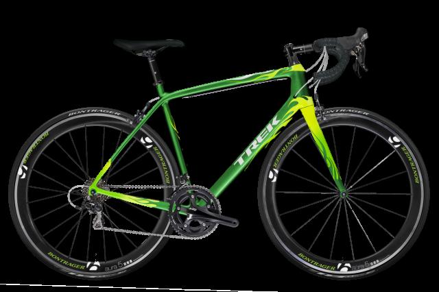
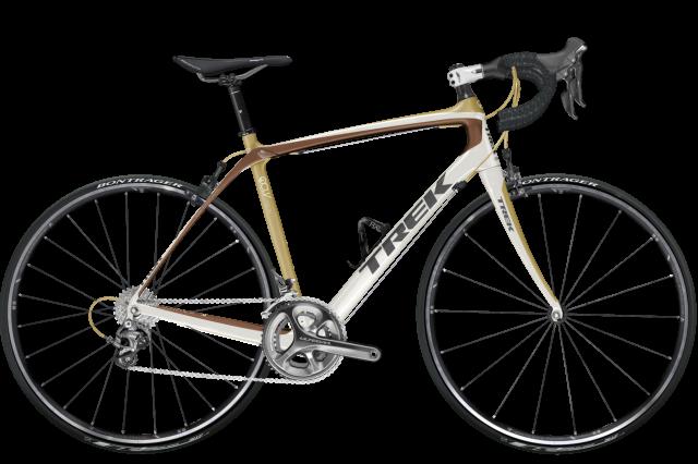
Well we've stroked our chins and looked at nearly 6,000 different bike designs, and in the end it's come down to this. 25 designs that made it through the initial cull, then the subsequent weighing-this-one-against-that-one discussions to finally land on the shortlist as the best* of the bunch.
Some people have clearly missed their vocation, getting quite a few designs into the long list, but we've picked 25 different designers for the final cut. And one of these bikes dun gone get made. We'll be opening voting next week so you can pick your favourites.
In the mean time, have a scroll through them and tell us which one you like best. If you want to take the time to tell us that we're a bunch of colour-blind morons that wouldn't know a beautiful bike from a hole in the ground, that's fine too. In fact, we demand it.
*yes, we know yours was better.

Dave is a founding father of road.cc, having previously worked on Cycling Plus and What Mountain Bike magazines back in the day. He also writes about e-bikes for our sister publication ebiketips. He's won three mountain bike bog snorkelling World Championships, and races at the back of the third cats.
Latest Comments
- brooksby 2 min 26 sec ago
Ah, but the terrorists build their invisible bases under those hospitals and refugee camps, and some of those children are just really short adult...
- chrisonabike 13 min 51 sec ago
Am I right in thinking that this has been the case in NL for over half a century (or 30 years nationally)? With a brief interruption from 2003 -...
- Bezzard74 19 min 40 sec ago
100% agree on all points! ...
- cyclisto 26 min 12 sec ago
I think this mostly....
- chrisonabike 1 hour 10 min ago
A good point - cyclists are somewhere between pedestrians and motorcyclists (a few - electric motorcycles mainly, which are not legal) in terms of...
- David9694 1 hour 35 min ago
Retired policeman from Swanley fined after forgetting to display blue badge at free Bluewater car park...
- Rendel Harris 3 hours 24 min ago
Welcome - probably didn't show as they tagged it "not near miss of the day"?
- David9694 10 hours 43 min ago
Cambridgeshire boy, 13, crashes Audi into garden wall after taking it from home...
- mattw 15 hours 26 min ago
Used car salesman is a complete attention-seeking plank....
Add new comment
111 comments
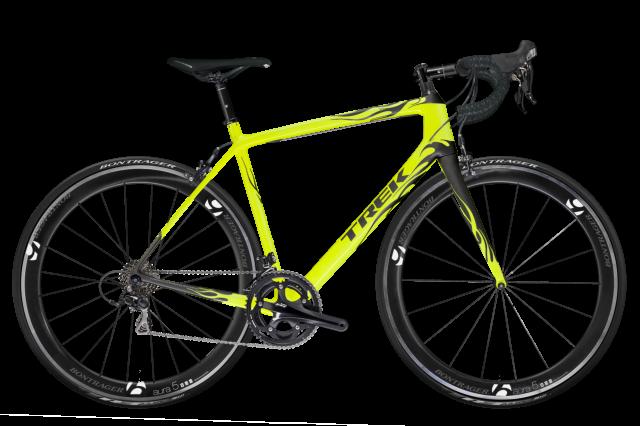
flames should be automatically disqualified. Personally I like Alice Carter's design.
Totally agree with u I think these bikes where picked by a blind person. I see most of them don't have Force on them so I think they went with the cheapest designs they could find. Shocking and you run bike website. Good job you don't run a bike design company. Got any pink tassels to go with the pink handle bar tape. Oh and how about a little ringing bell on there to. Disappointing choices to say it nicely.
Guideline #4 of vehicle design -
'Flames, wings and anything that may be found on a hell's angels motorbike are cool. This also applies to colour.
Logos should incorporate flames, wings, wheels or possibly mountains. A huge phoenix rising from a burning mountain with a halo of a wheel, for example.'
Pleased to see so many flames options there. Good work )
18 will go with most of my Rapha stuff!!!
Jeez, my eyes!! Two or three very classy-looking bikes and far too many that look like a bad 1990s explosion in a paint factory. Bula hats and purple anodising compulsory.
14 or 15 for me. Anything with white or fluoro bar tape should be immediately DQ'd.
Seconded
Gutted I didn't make it!
Faves off a pretty dull and uninspiring list are 3/10/15/17, and 15 will get my vote.
Alice Carters s lovely.. because it is virtually the same as one I did!
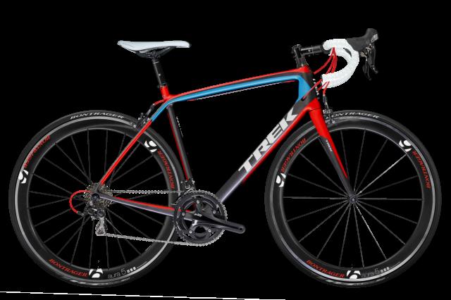
Design by Darren Collard: Enjoying all your comments here , what the image of my design doesn't show is that the paintwork is not just gloss, it's also metallic, and the tyres are pink as well!
I chose the metallic to add that bit of glamour that only the Giro can provide and obviously the pink represents the leaders jersey the 'maglia rosa'. It's not all designed from the heart though, I've upgraded the wheels and groupset to reflect the Giro's arduous climbs, the toughest of any Grand Tour. My design has meaning, it's a tribute to the Giro d'Italia.
16 is the only one I would ride.
You're not in art college now, Dazza. No-one cares
I kind of regret not ignoring the £3200 limit now.
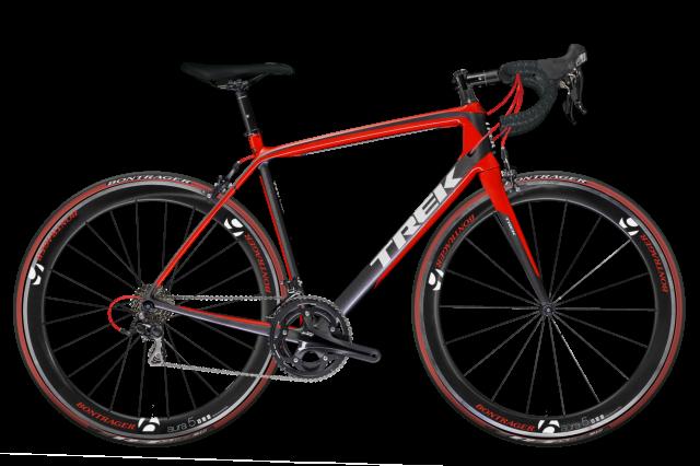
FSA crank arms and Aura 5 wheels do look good.
I would not take a free Trek. Same company that supported Dopestrong despite clear knowledge it was all FRUAD. Trek buried the Lemond brand despite Greg being 100% right about fraud, abuse and doping. To buy a Trek is a slap in the face to clean sport.
I agree, one of my designs had this combination too, but my other design got picked instead.
You might not, and I'm fine with that, but some people don't know or recognise why the design has flashes of pink on an Italian flag coloured frame. It shows that some thought beyond 'that looks pretty' has taken place, as all design should be!
#17 - I'm doing something similar with my Cinelli at the minute and think it looks slick.
12.
You're a bunch of colour-blind morons who wouldn't know a beautiful bike from a hole in the ground.
Nice one JonSP!, thanks for that (where's your design then?).
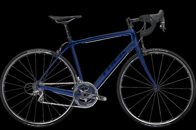
How does a black on black design get in the shortlist ?
or a blue on blue one... not much imagination there really is there - v.poor shortlisters! And my multicoloured creation is not even listed - how very dare you, that's it you're off my Christmas e-card list!
I had a feeling the remit for judging might be based not on taste, but on how much of the customisable stuff you used. So something with black, mint, yellow and pink with tassles on the bar ends would beat anything that anyone with any taste would choose to ride....oh, well, maybe next time.
I know I would prefer a free bike - but there's the other part of when would you ever use anything so hideous.....
my designs - so cruelly and tastelessly rejected by the judges - like Darren's, reflected a number of deep and meaningful concepts, drawing inspiration from a well of cultural and historical reference and pursuing a post-industrial-neo-revisionist-rococo-punk-aesthetic that appealed both to the mainstream and the bleeding edge taste while simultaneously shifting, rotating, destroying and reconstructing the paradigm, thinking in 4 dimensions spatially relative to the box, exploring new avenues, challenging norms and asking the question "if I actually won, could I sell this on eBay?"
On the surface it might have just looked black with red bits but frankly, it's just as well it wasn't picked because you philistines clearly aren't ready for that amount of design genius yet.
Are all these bikes with pink in the colour scheme WSD models? If so, most of these were done by husbands/boyfriends, which is a bit of a cheek as the bike won't actually then go to the winning designer.
I'll be rooting for #12 then on that basis. Think I know of the entrant, don't personally know her, but I suspect she might do some "chicking" on it too.
The link is obvious. The reason behind the design less so. Most people probably don't realise that you are Italian
Without meaning to offend the creative skills of the shortlisted,
that is a pretty poor shit list guys.
oo[s, that was meant to be short list

not so keen on all the flame designs!
#3 (Stuart Knipe) is my fave as it matches my club colours.
I'd go for an orange one personally but none of the ones here quite do it for me.
not that I've designed it knowing i have some Rapha gift vouchers burning a hole in my pocket from christmas...
What a shame you've all missed out on the chance to see my black, red, gold and green 'Trek Bob Marley'.
I'd apply this logic...
- disqualify any design incorporating flames, obviously not cool


- disqualify any design with non colour matching saddle and bar tape, again not cool
- disqualify any design that prioritises deep section rims over higher spec gruppo, again very not cool
- and of course disqualify anything with any brown in the colour scheme, need I say more...
& #14 gets my vote
Pages